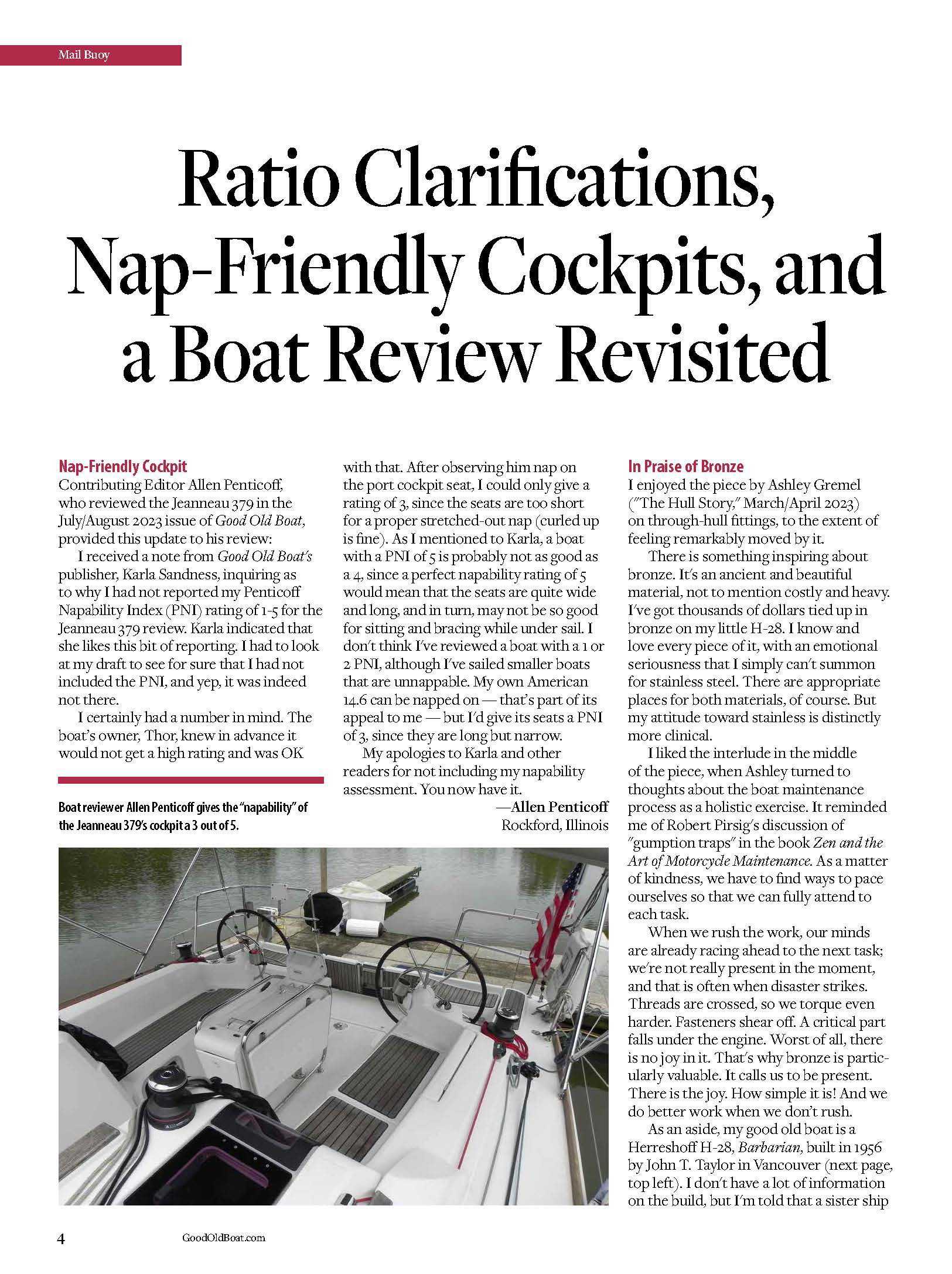
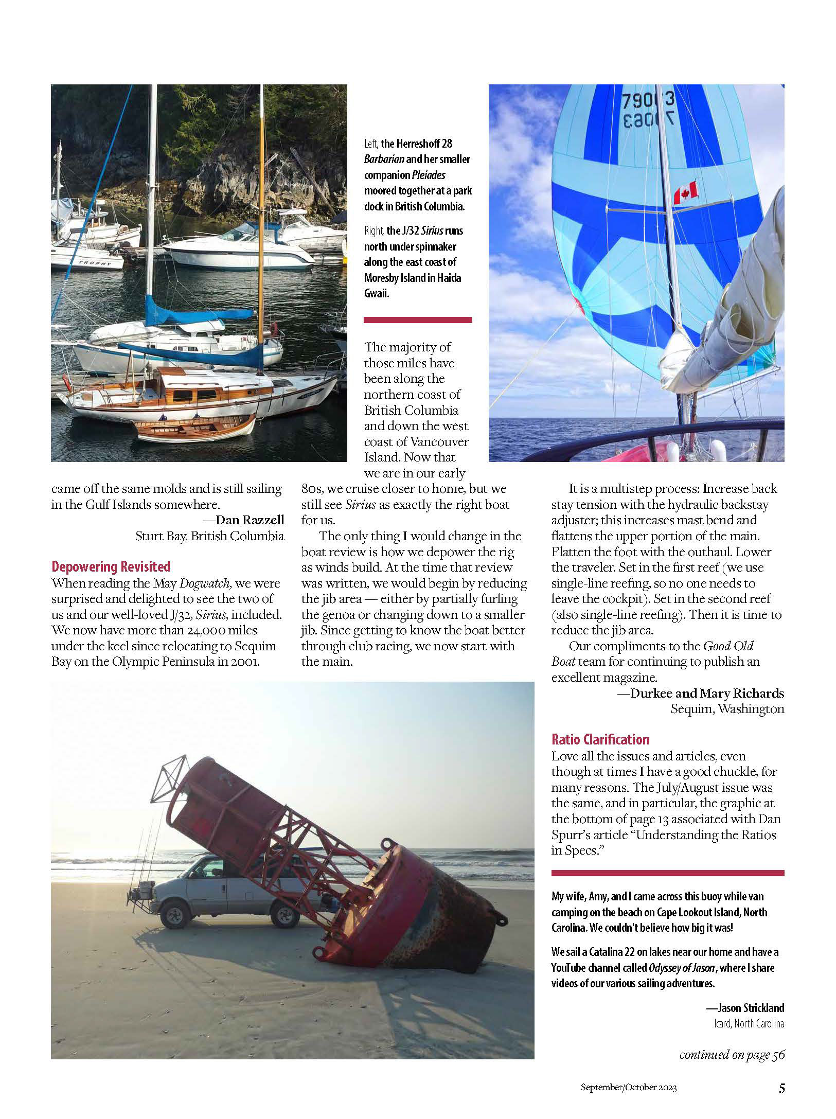
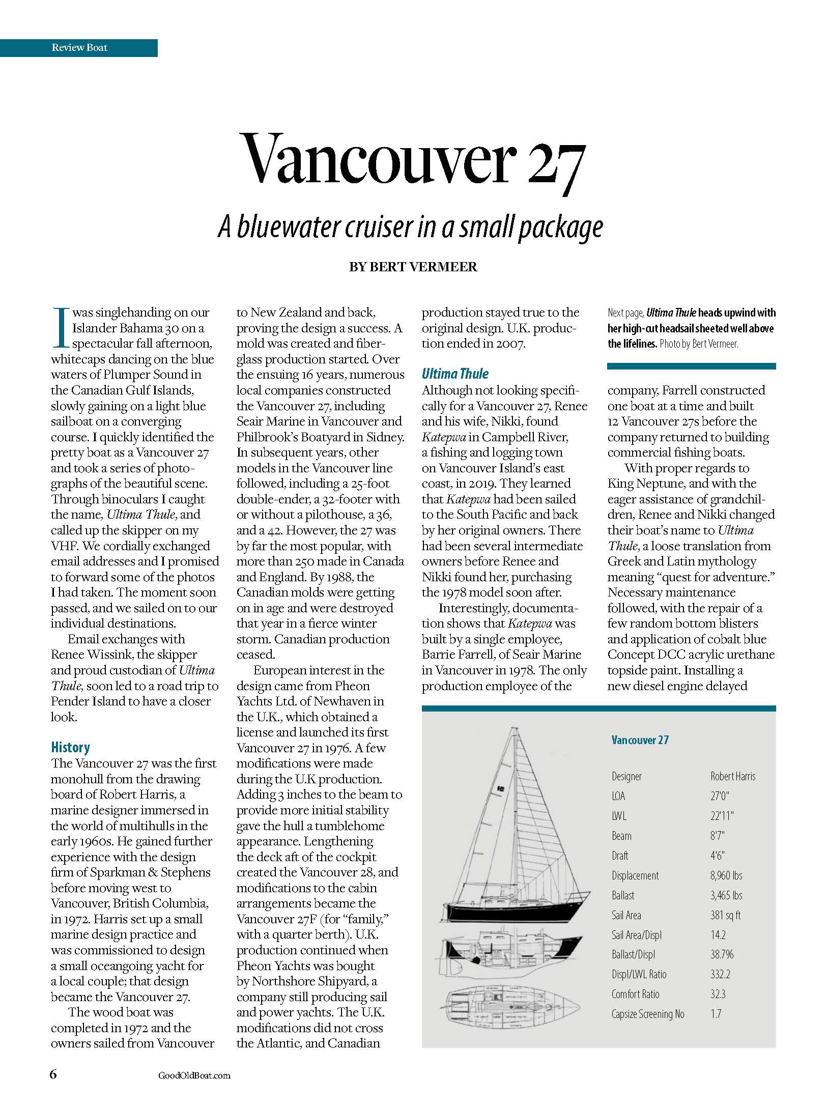
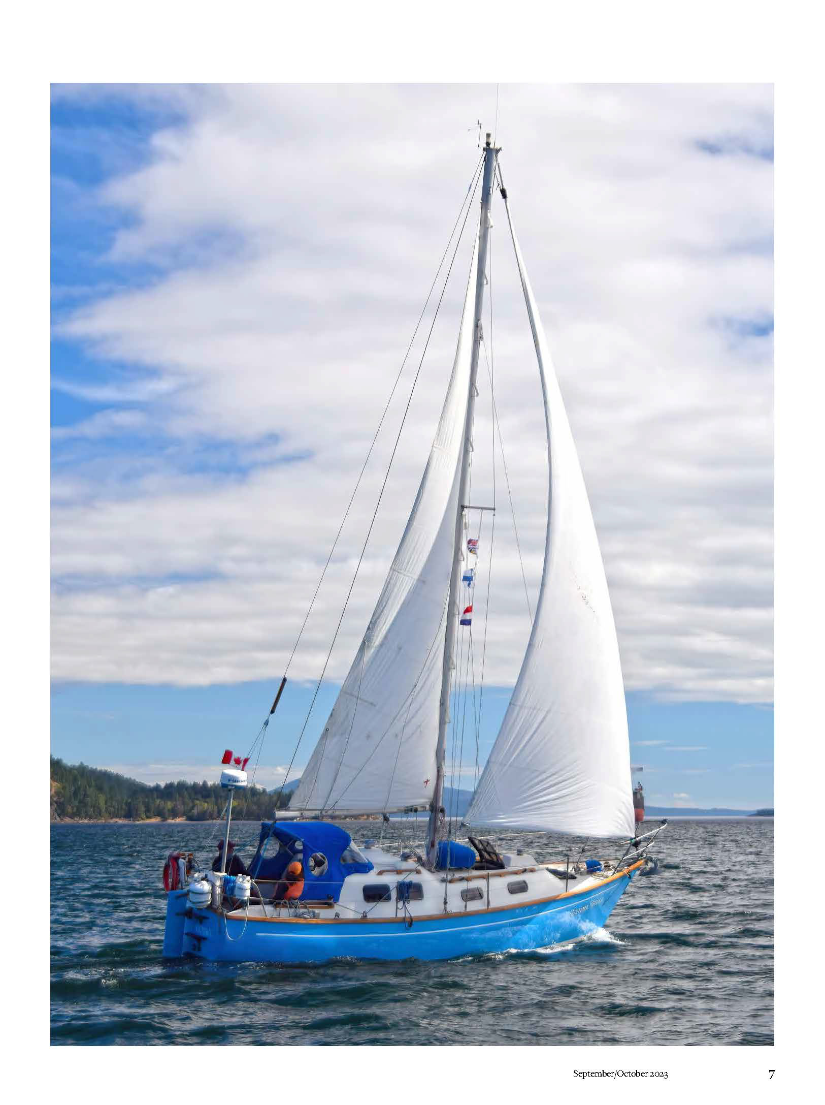
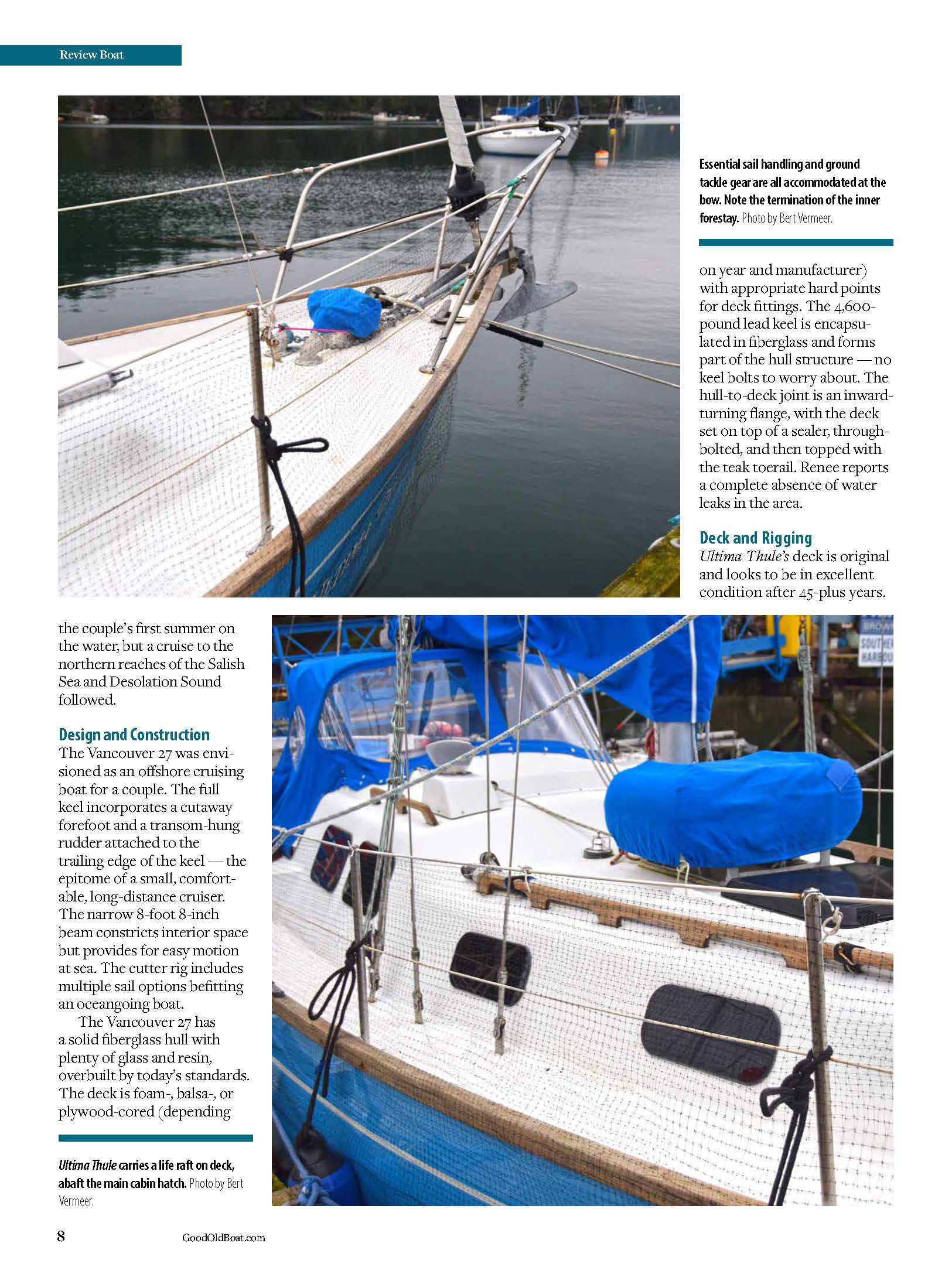
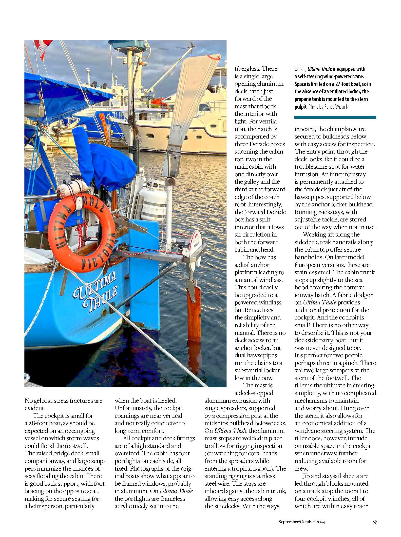
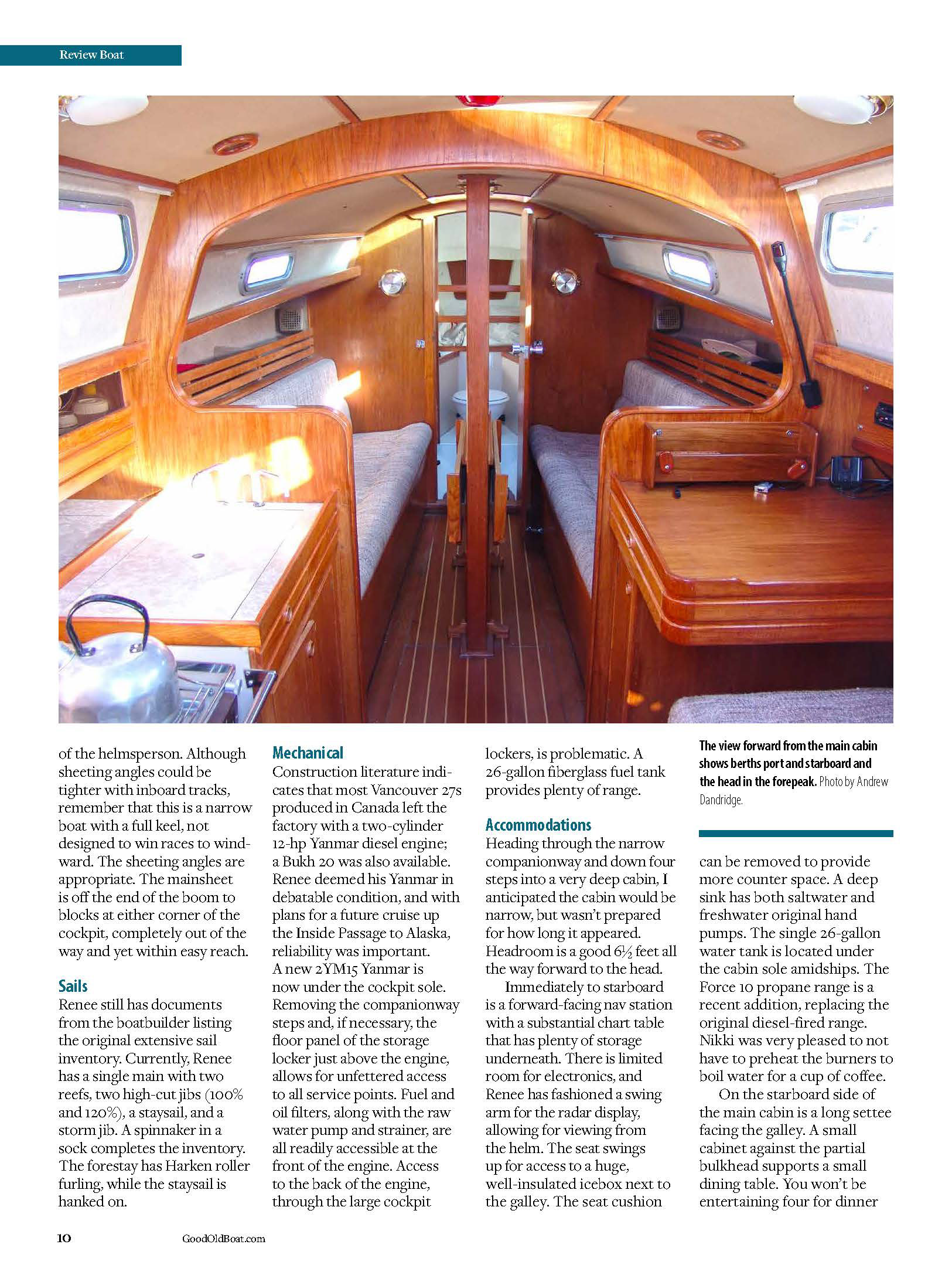
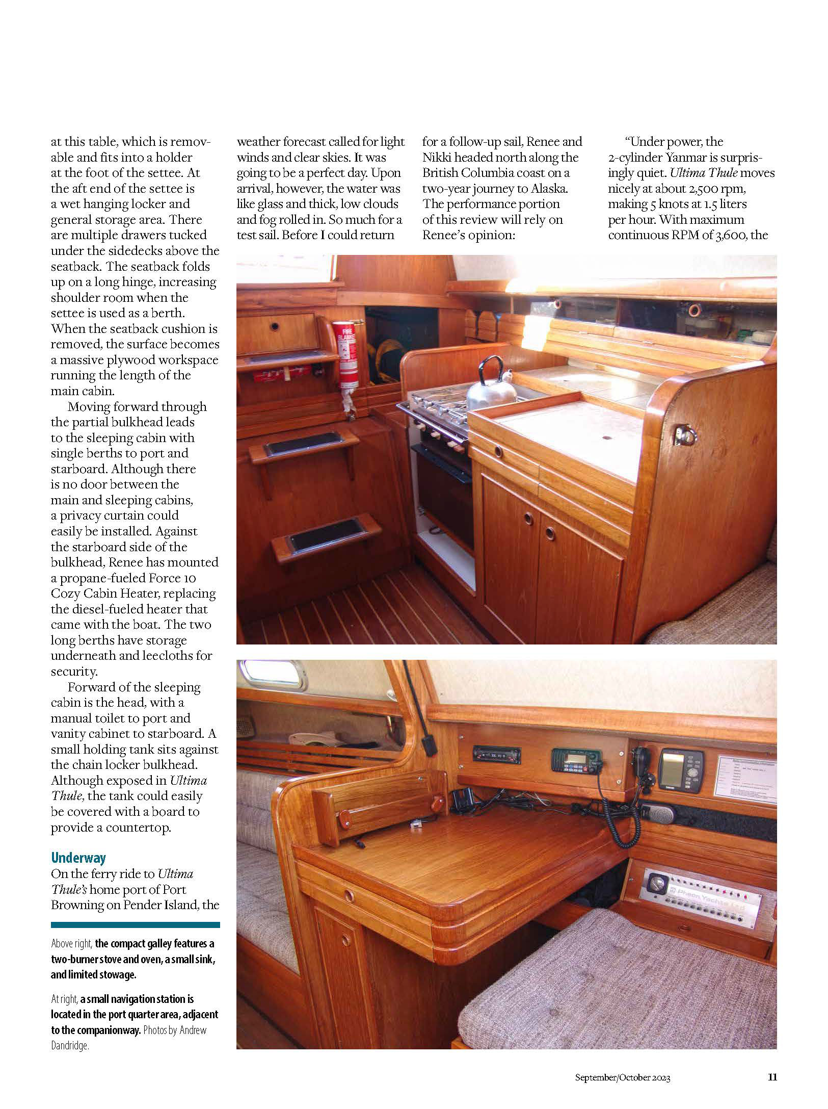
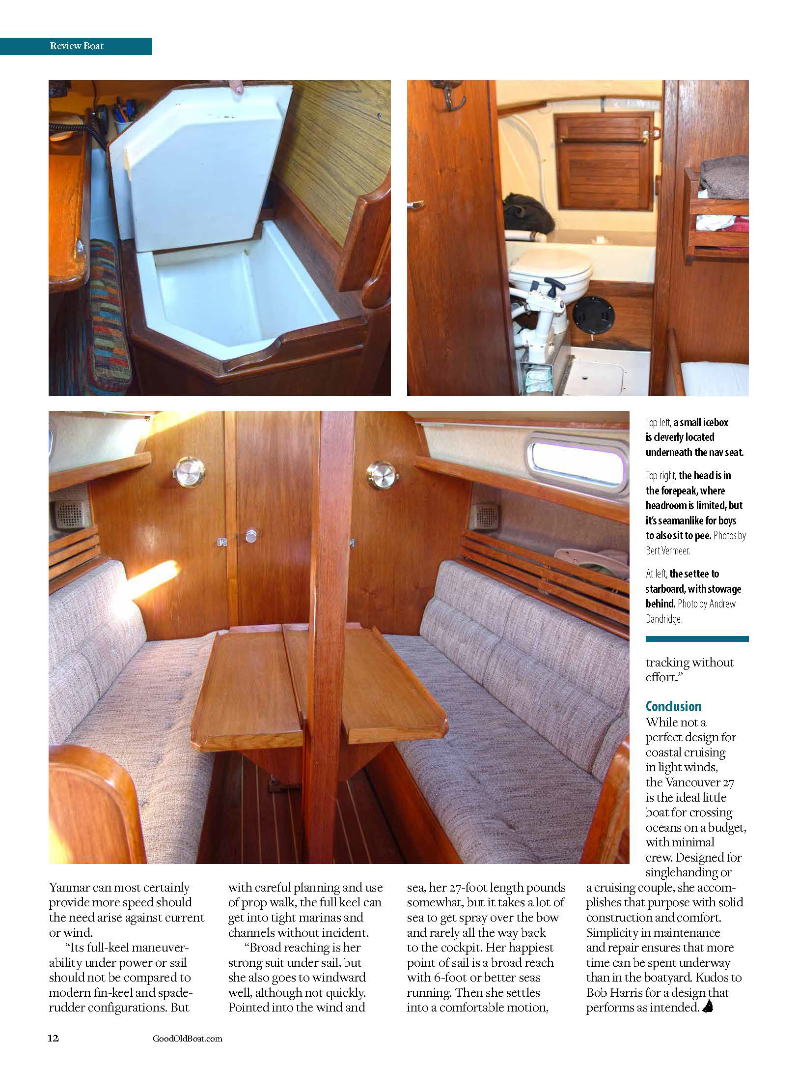
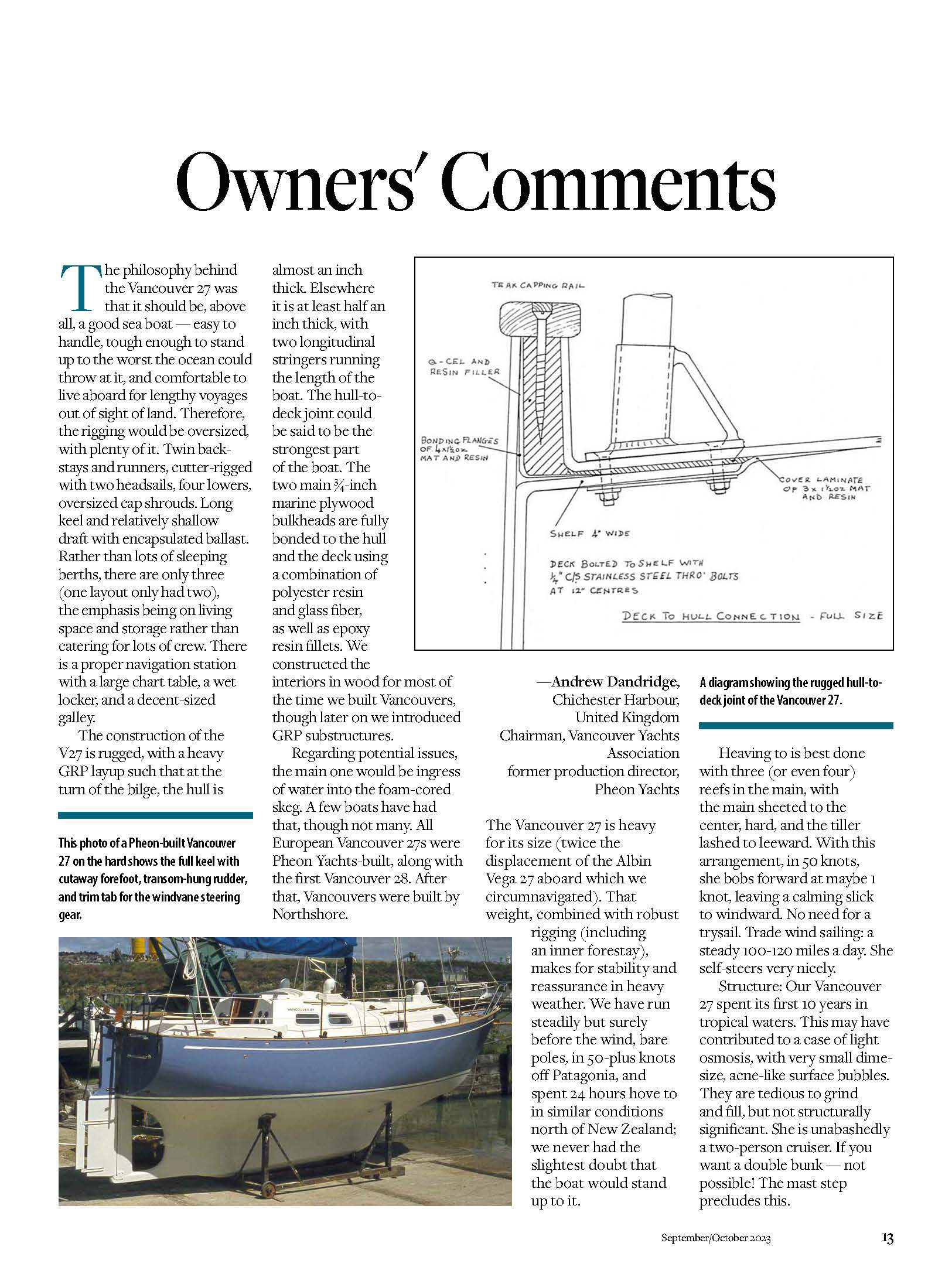
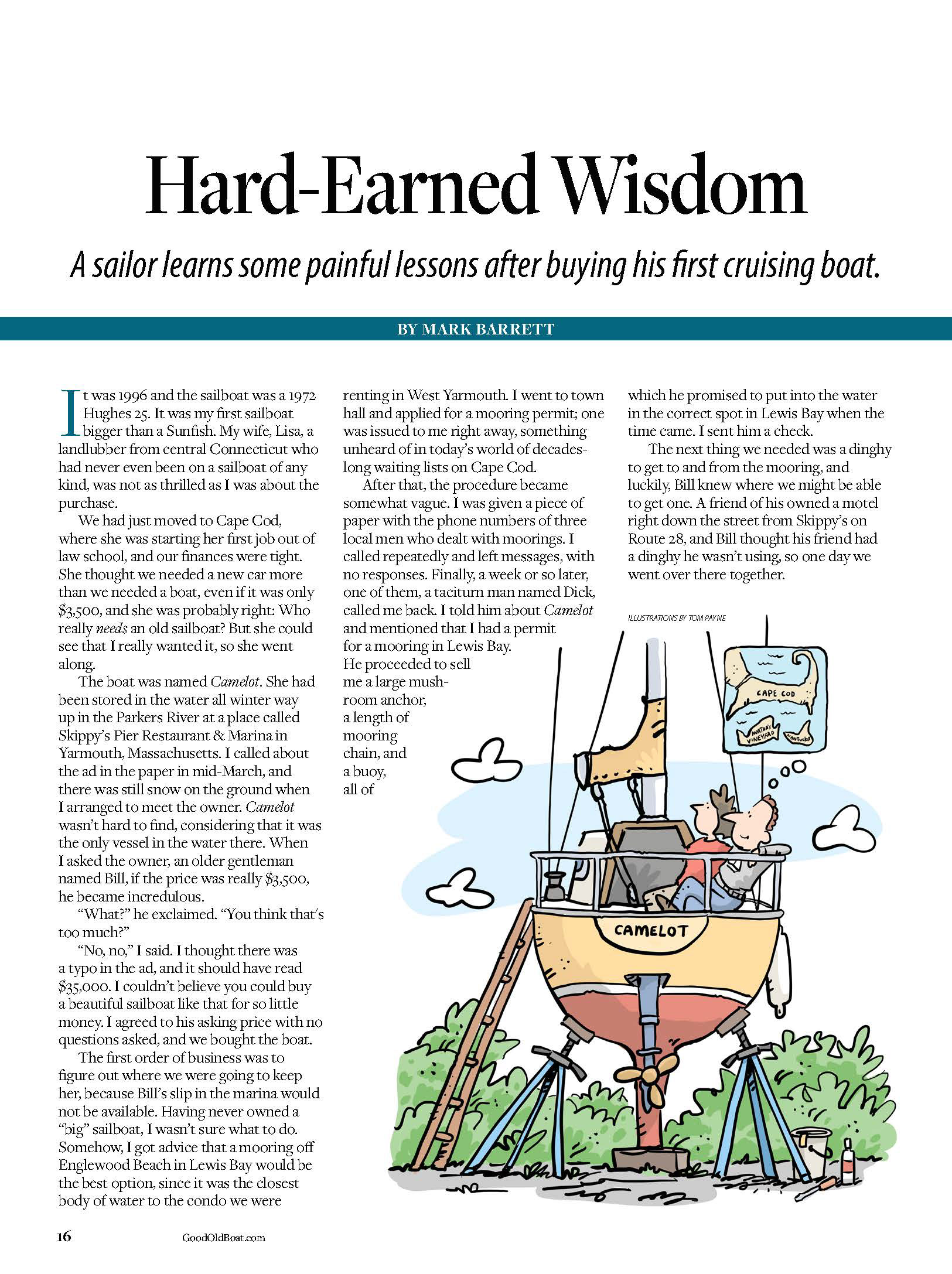
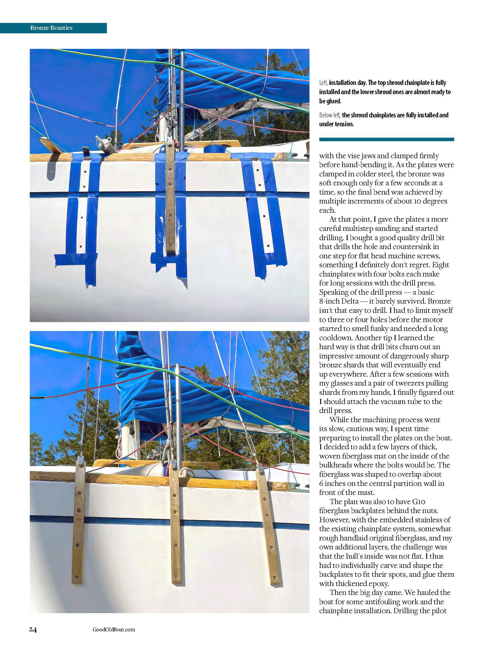
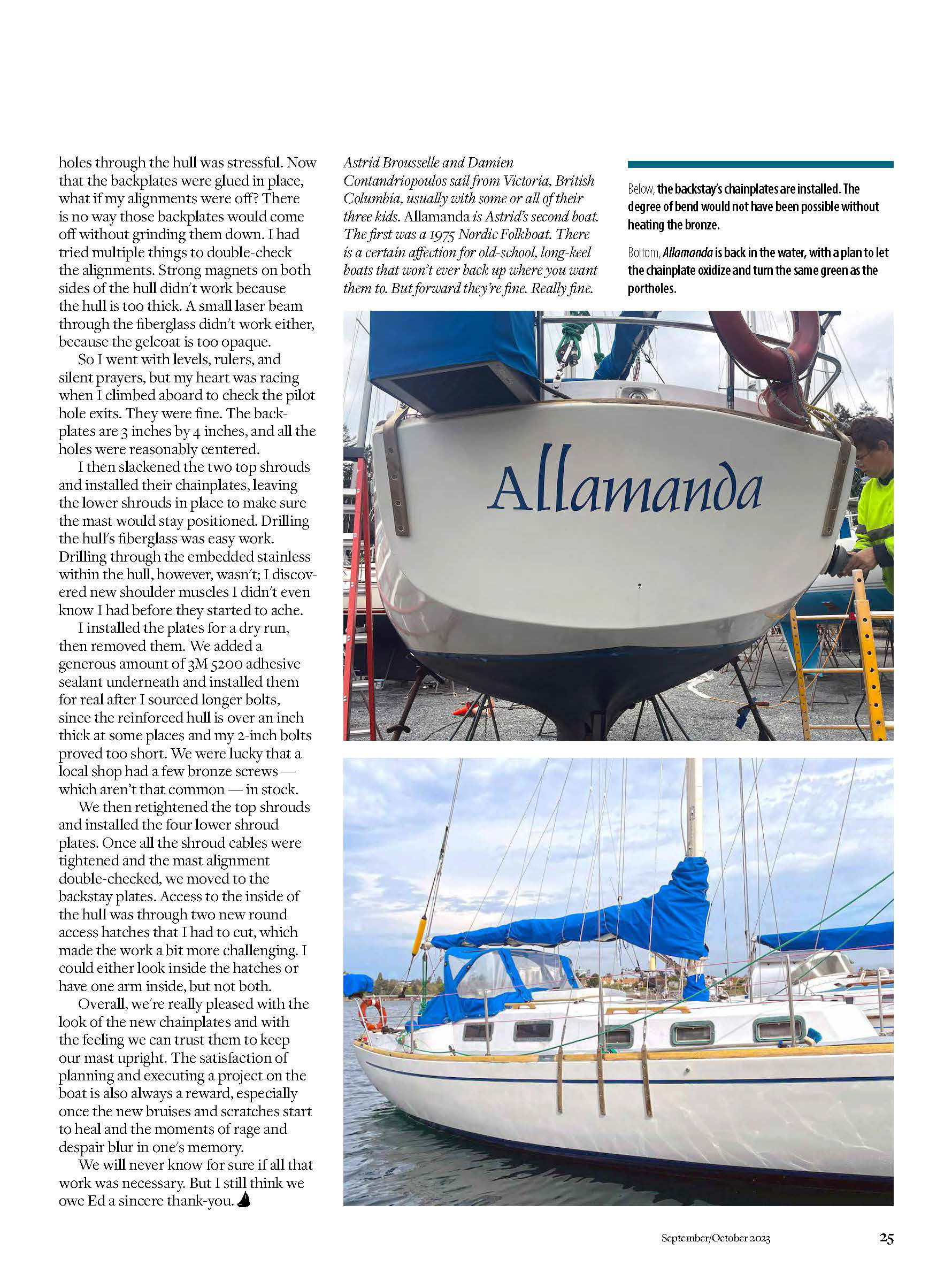
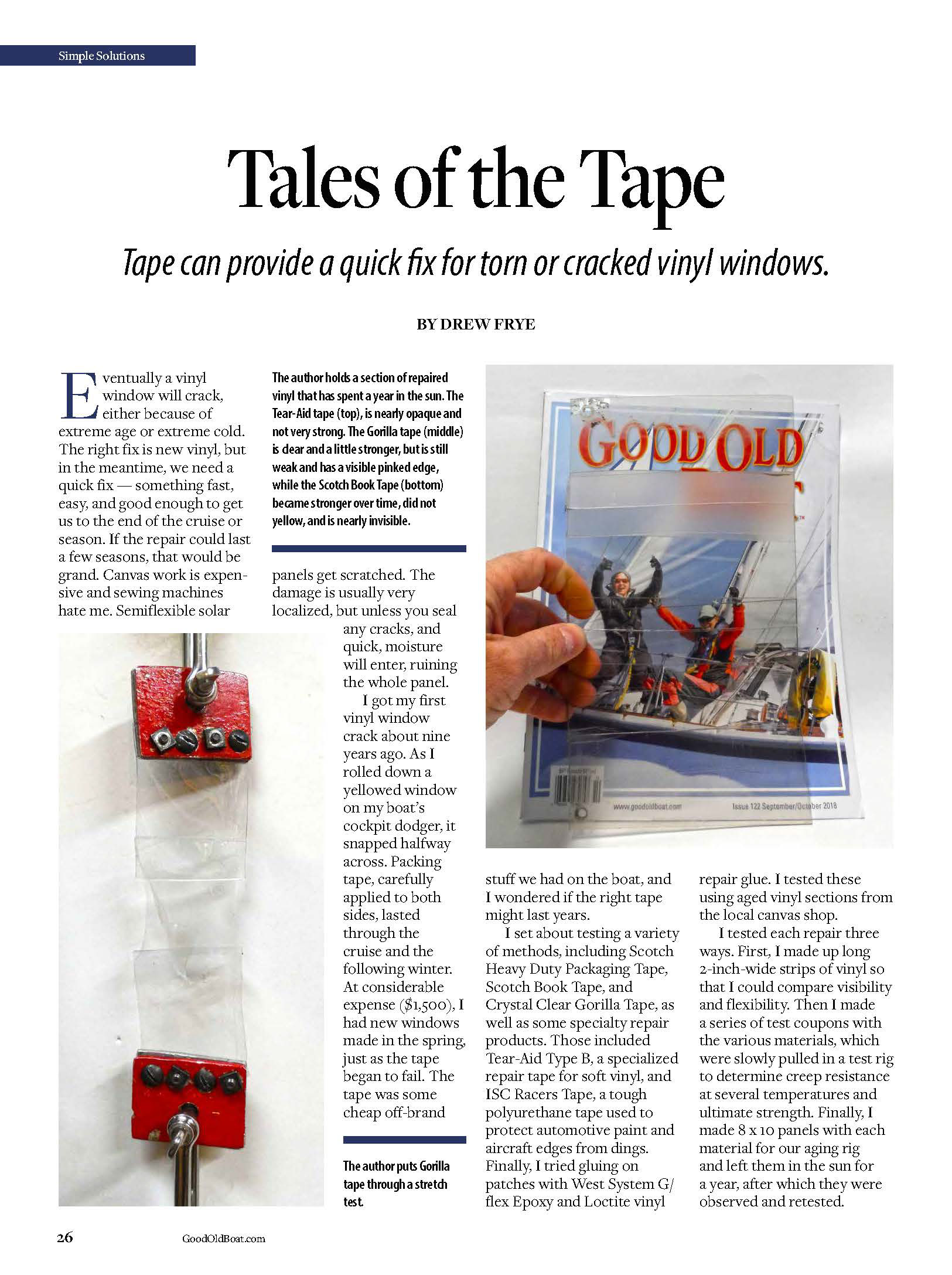
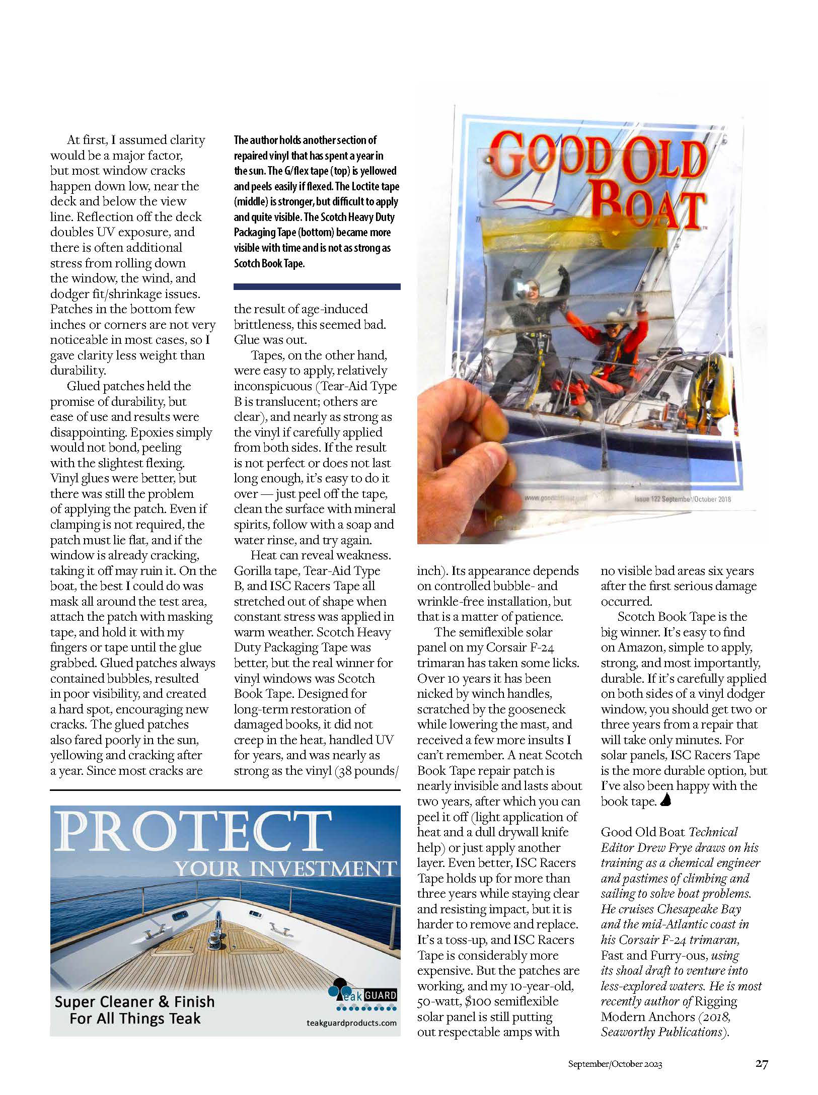
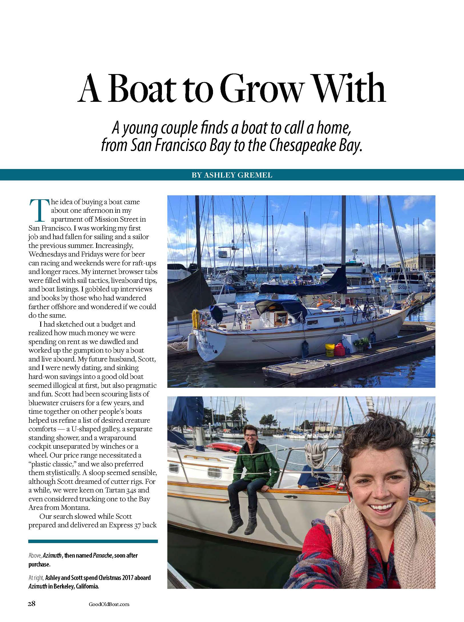
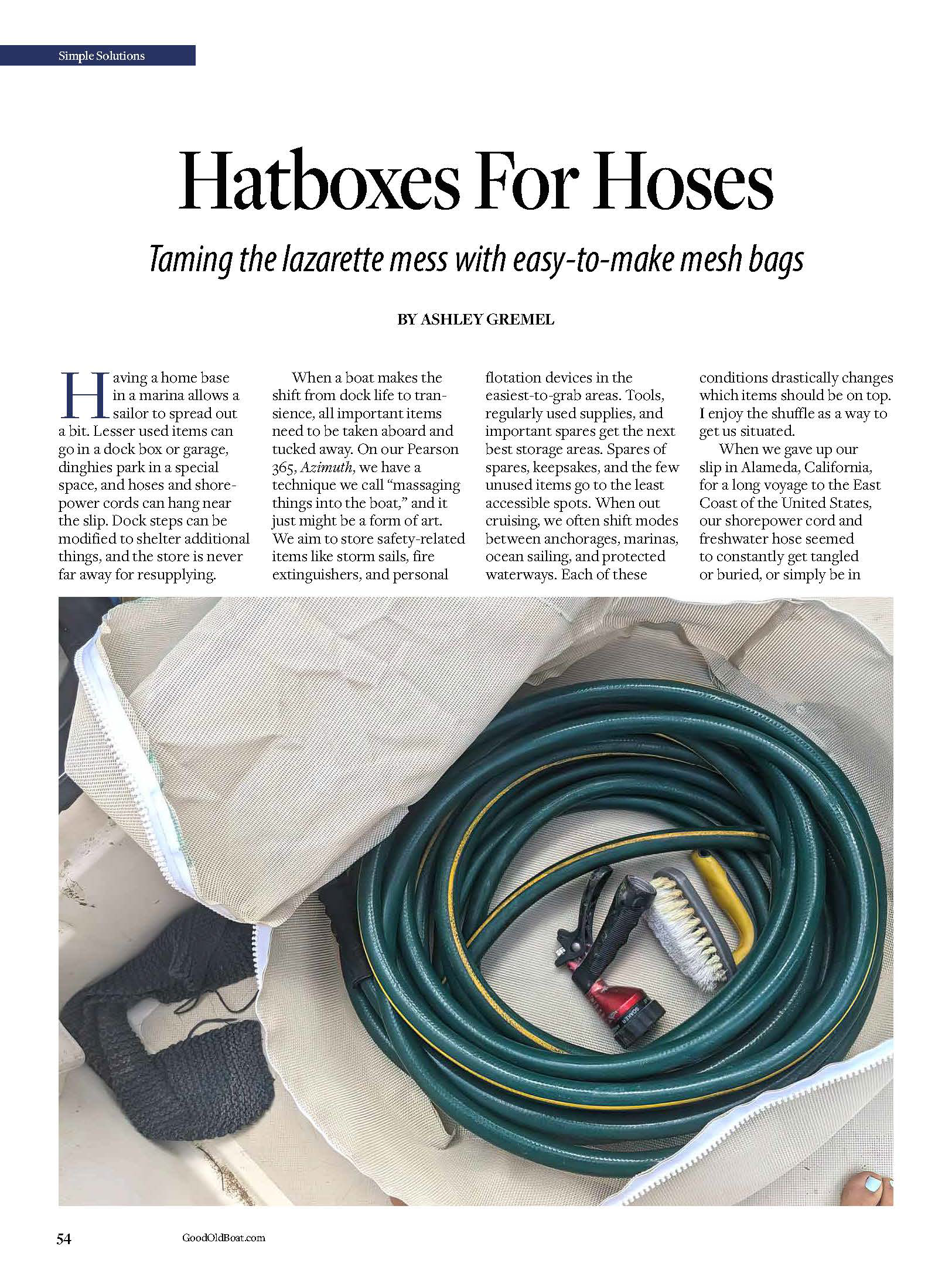
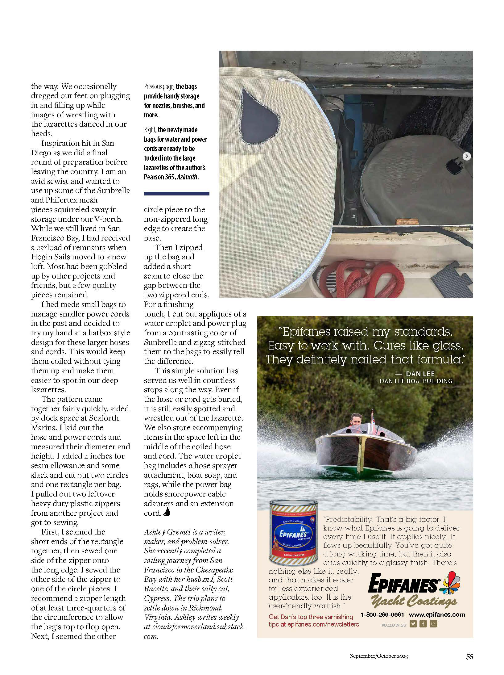
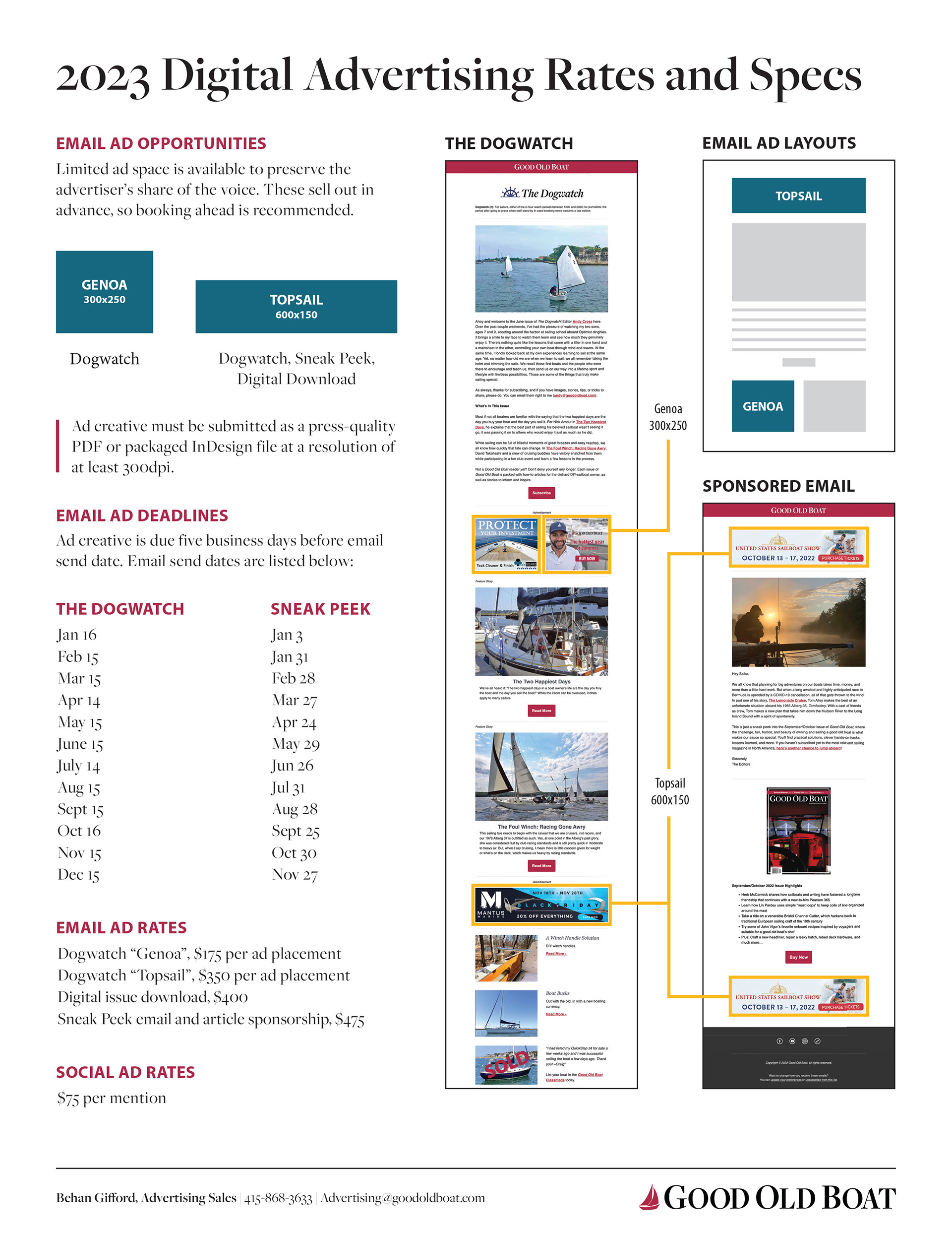
Bi-Monthly 64 page Print Magazine
Role: Creative Director, Designer

PROBLEM
Good Old Boat was (unfortunately shut down in 2024) a beloved, hands-on sailing magazine cherished by DIY sailboat owners. As the magazine evolved, it required a modernized visual identity and layout strategy that maintained its trusted, handcrafted editorial voice. The existing brand felt dated, layout consistency was inconsistent, and the overall look didn’t reflect the magazine’s quality content or engaging subscriber base.
Focused Solutions
As Creative Director and Designer, I spearheaded a brand refresh and style-guide overhaul to bring cohesion, clarity, and visual appeal to the publication:
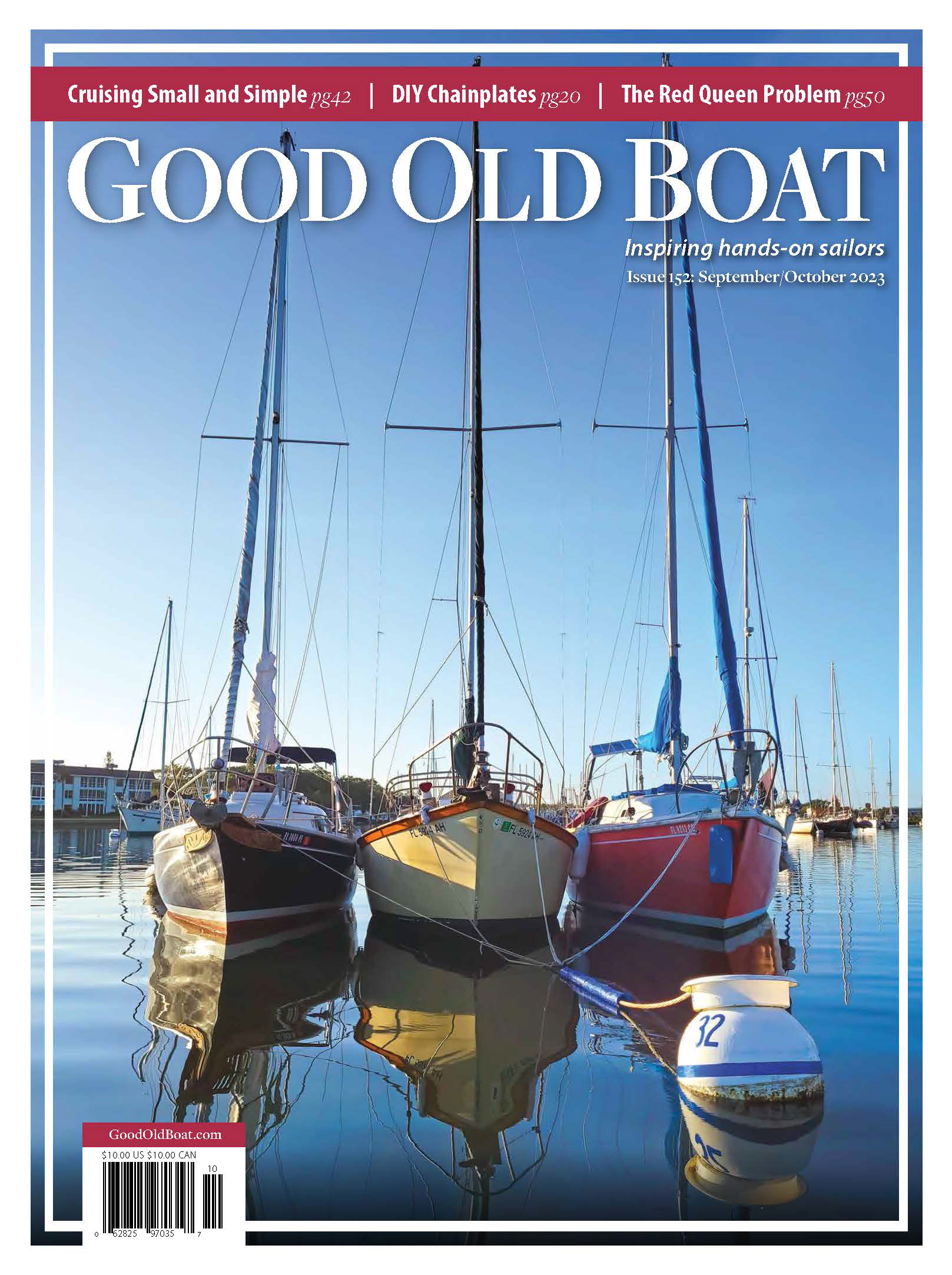
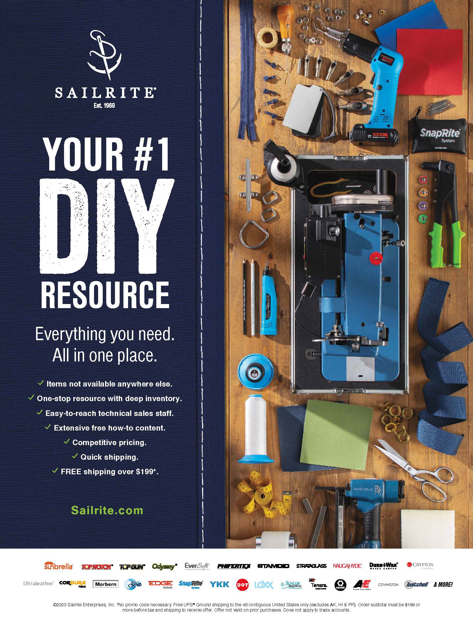
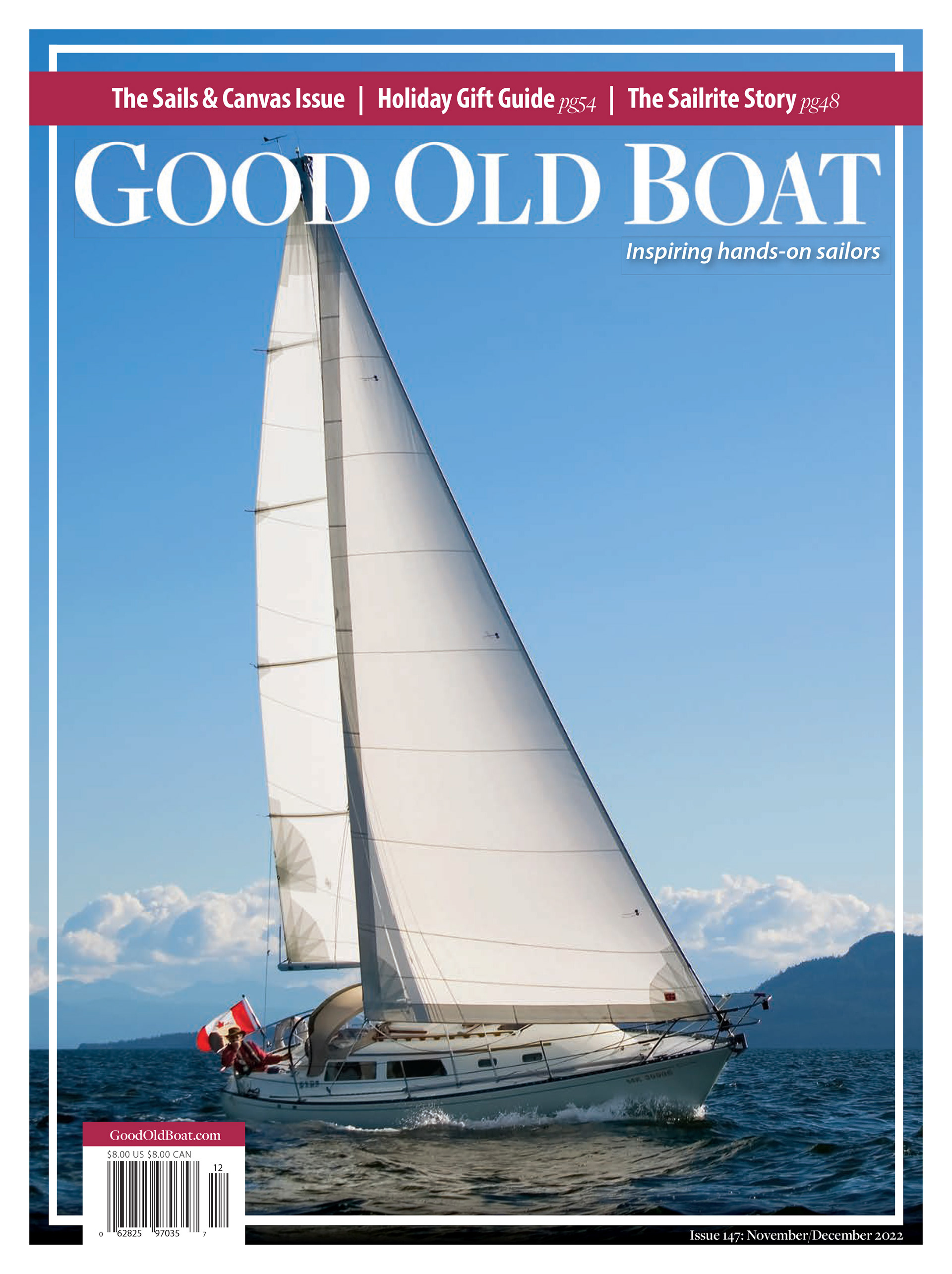
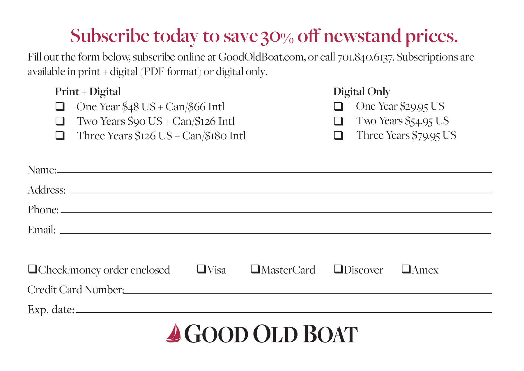
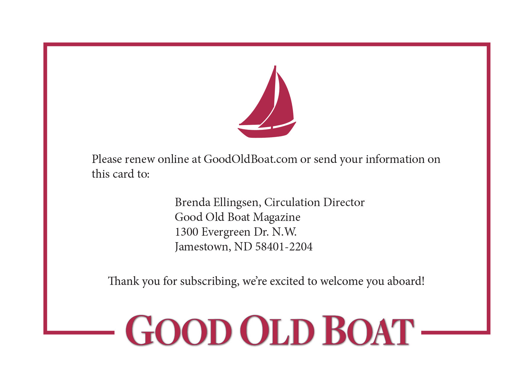
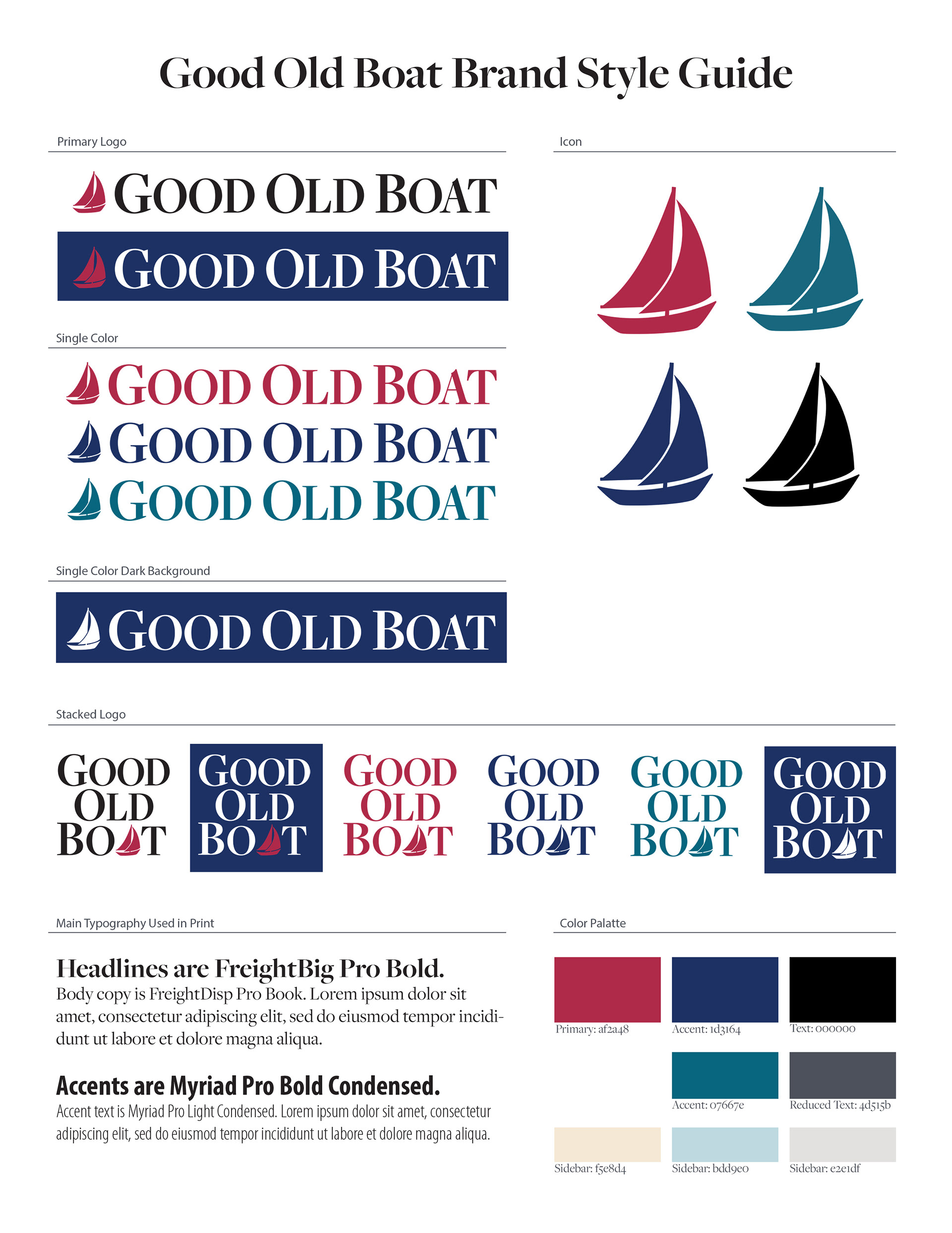
Rebranding and Cover Refresh: Elevated the magazine’s presence on newsstands and in mailers by redesigning the cover with cleaner typography, better hierarchy, and nautical-inspired styling—while preserving its authentic, rider-friendly feel.
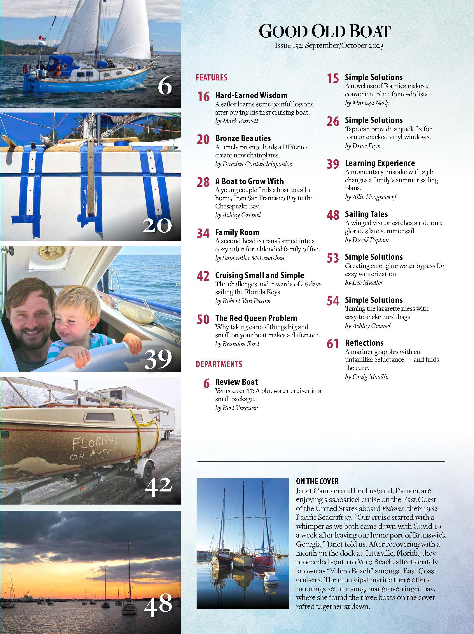
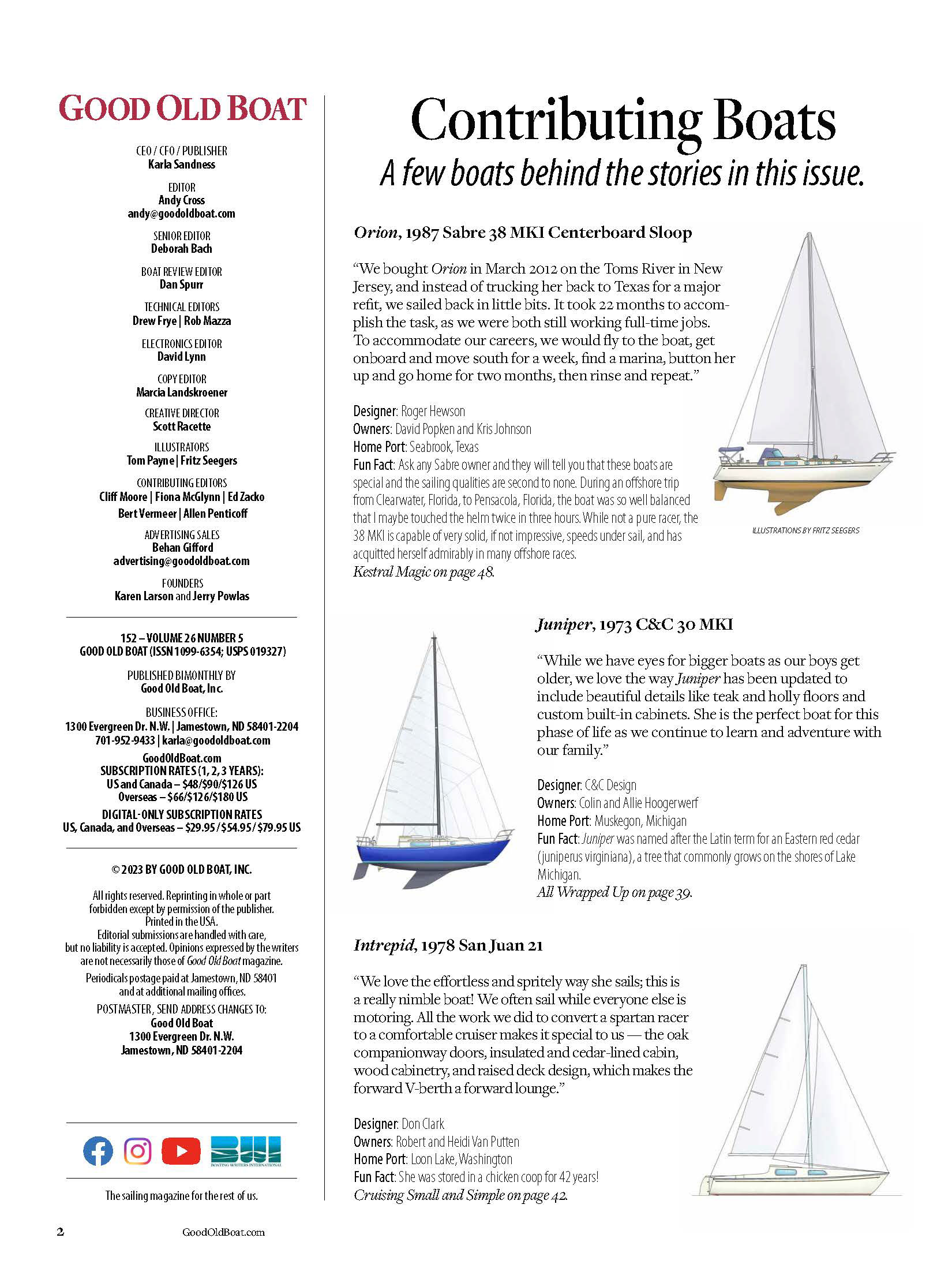
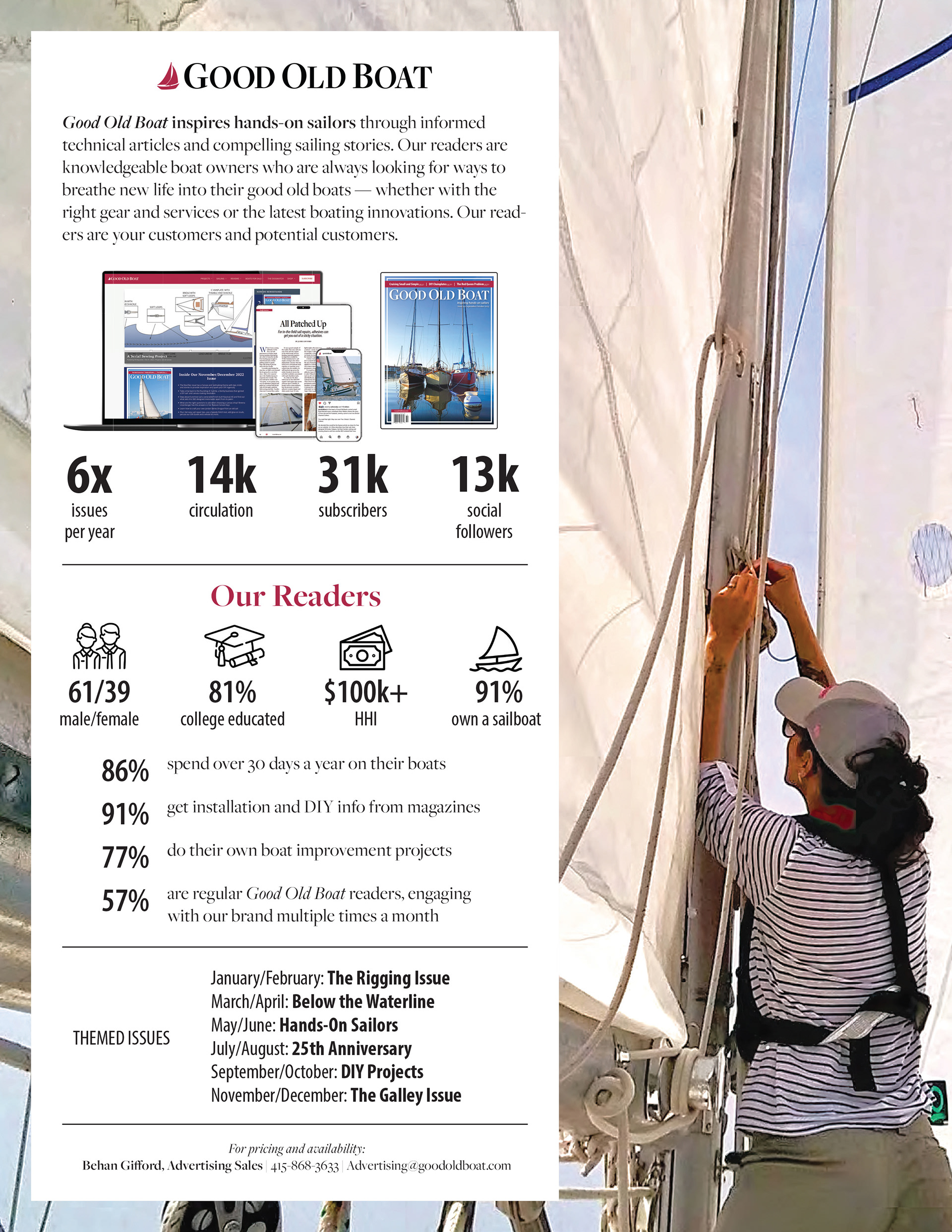
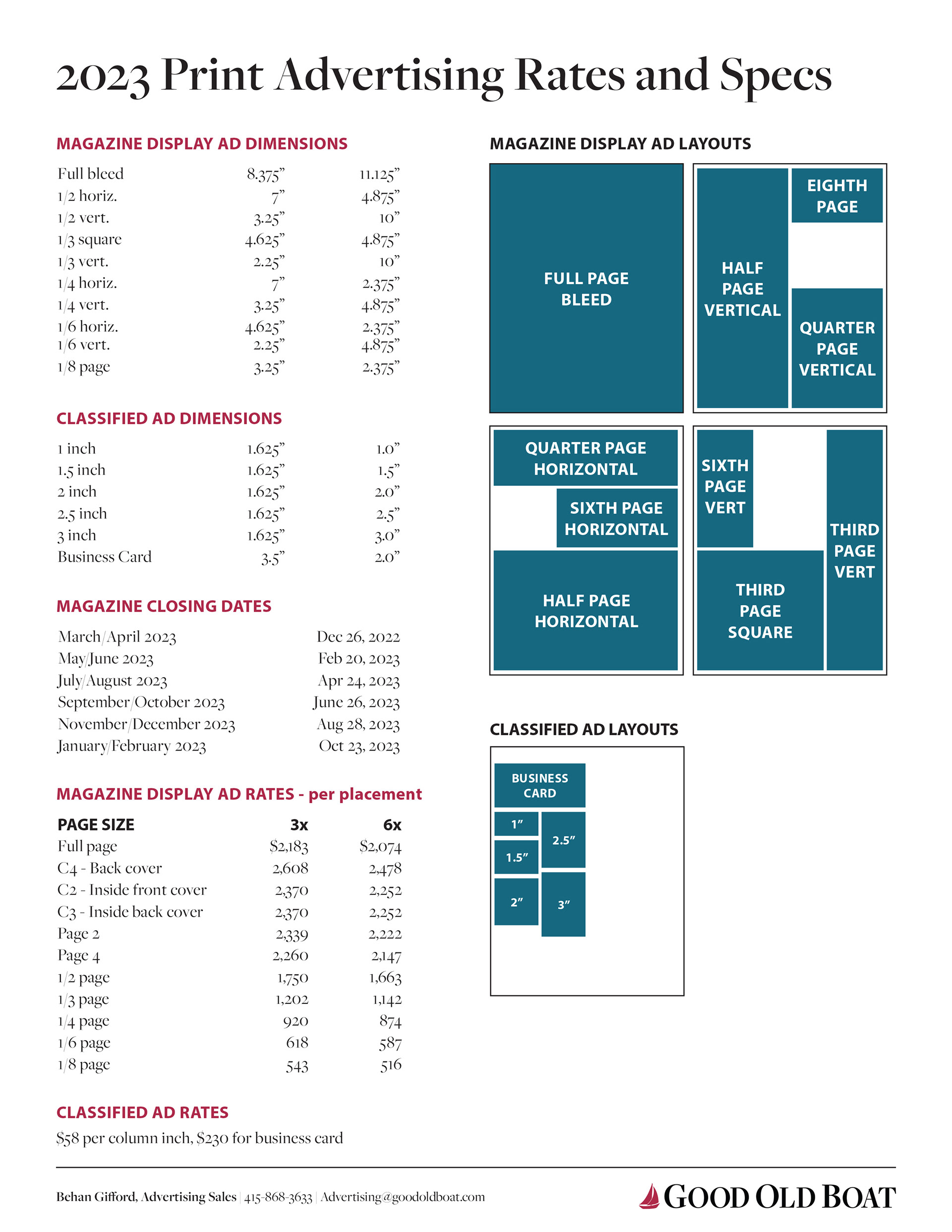
Consistent Style Guide: Established a formalized style guide with rules for typography, color usage, masthead treatment, and visual hierarchy—enabling uniformity across 64 pages, issue after issue.
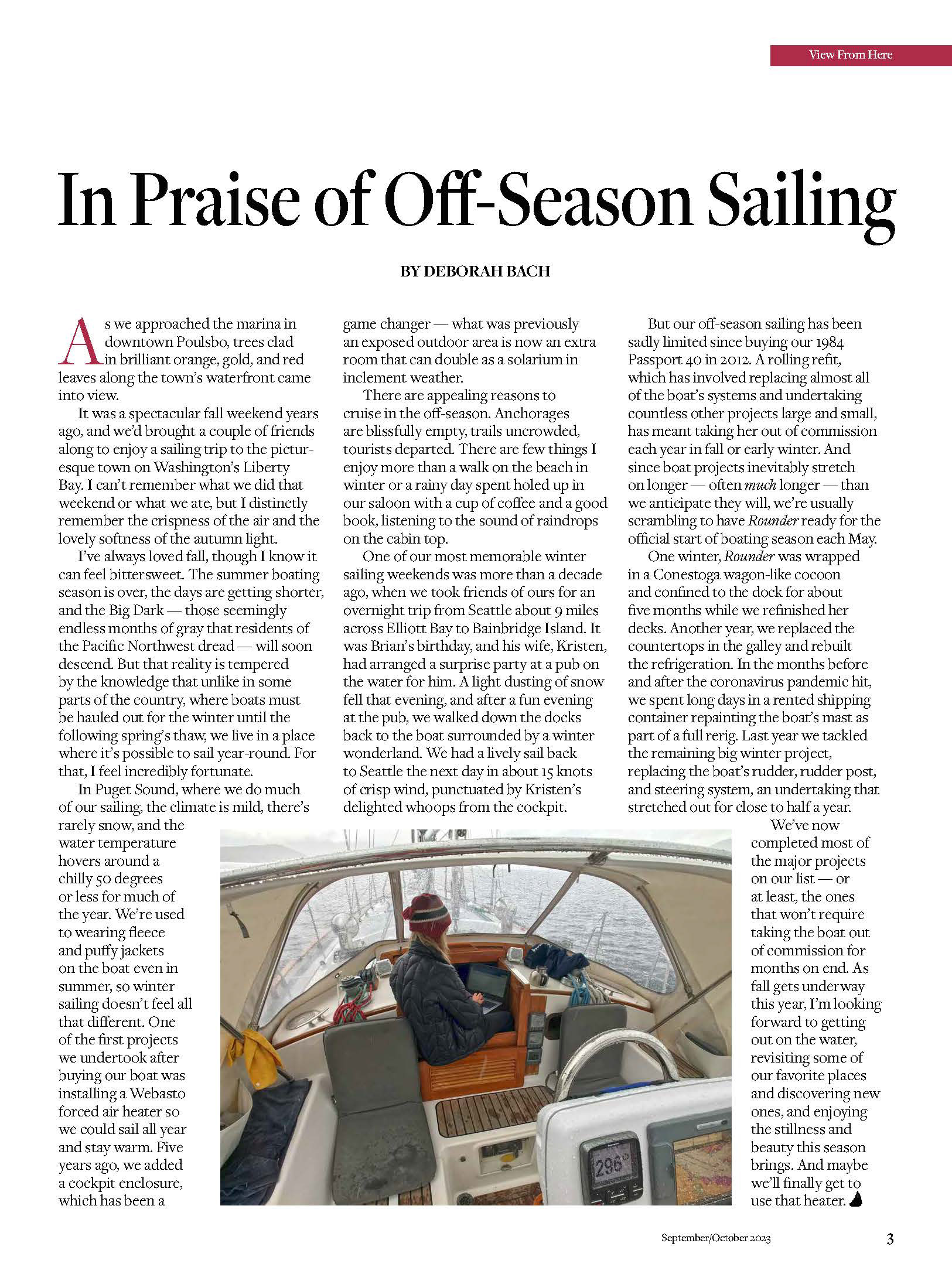
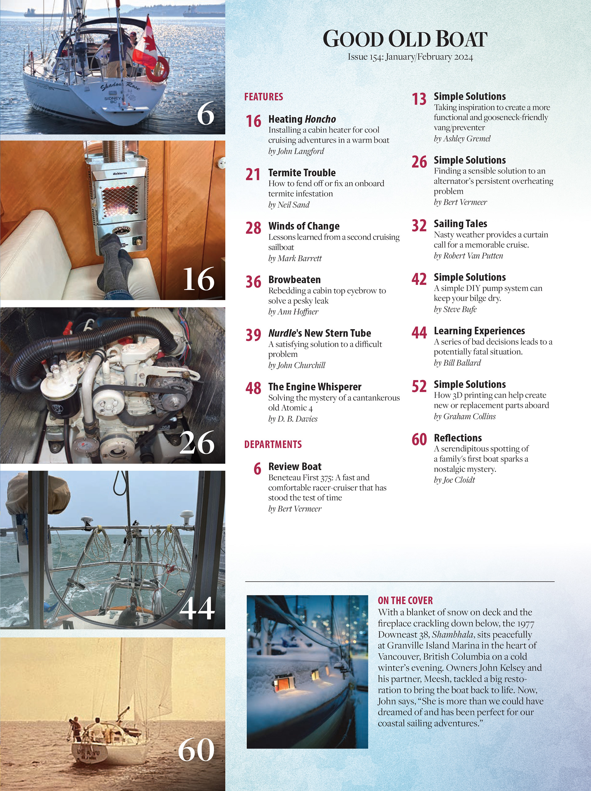
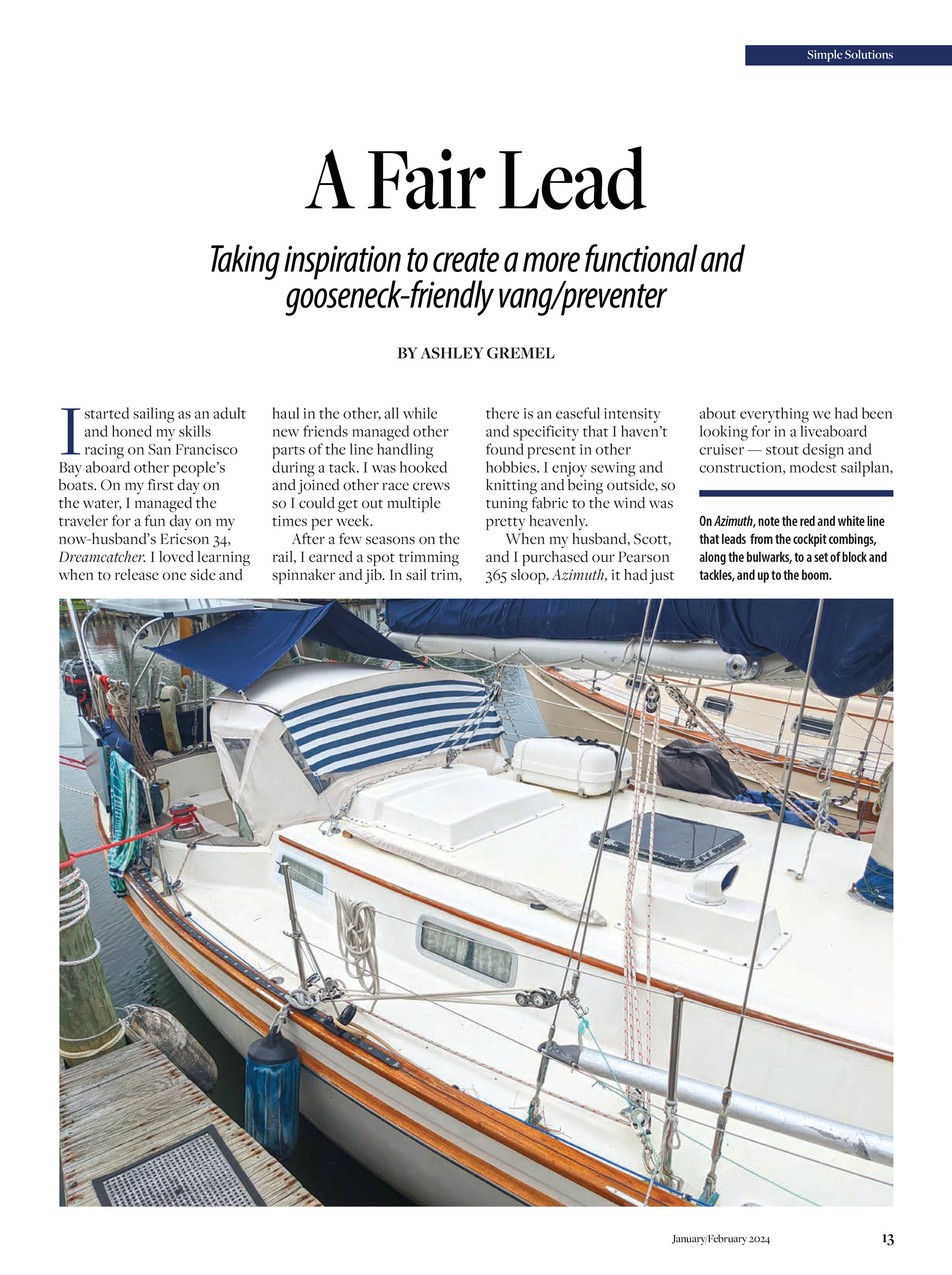
Layout System and Templates: Designed modular, repeatable page templates for article spreads, feature stories, and columns. This structured framework allowed for flexible yet predictable layout flow, making production smoother and more efficient.
Typography and Graphic Touches: Introduced elegant serif and display font pairings, nautical motifs (e.g., rope graphics, compass icons), and strategic whitespace to give pages visual breathing room and evoke the spirit of sailing.
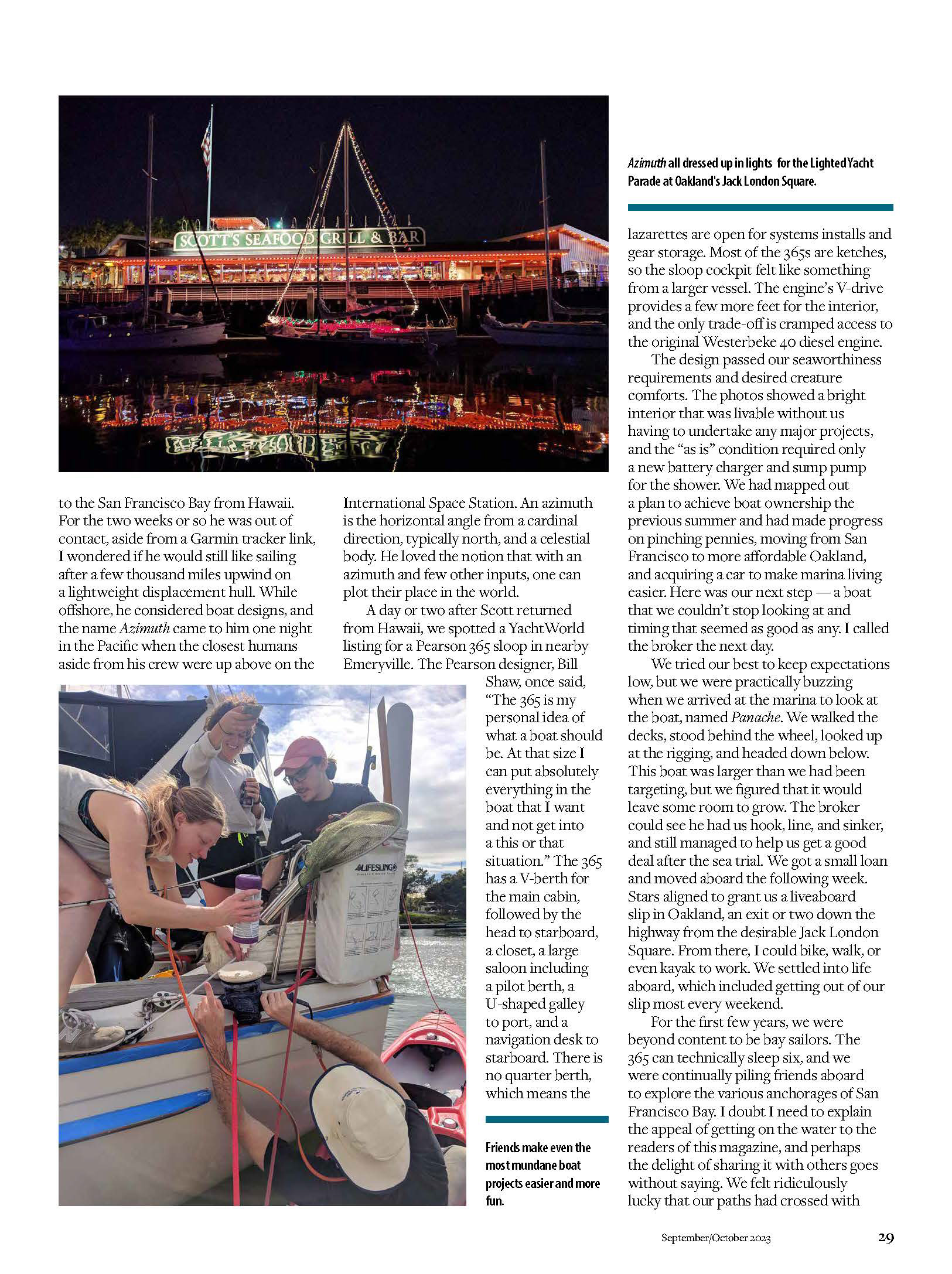
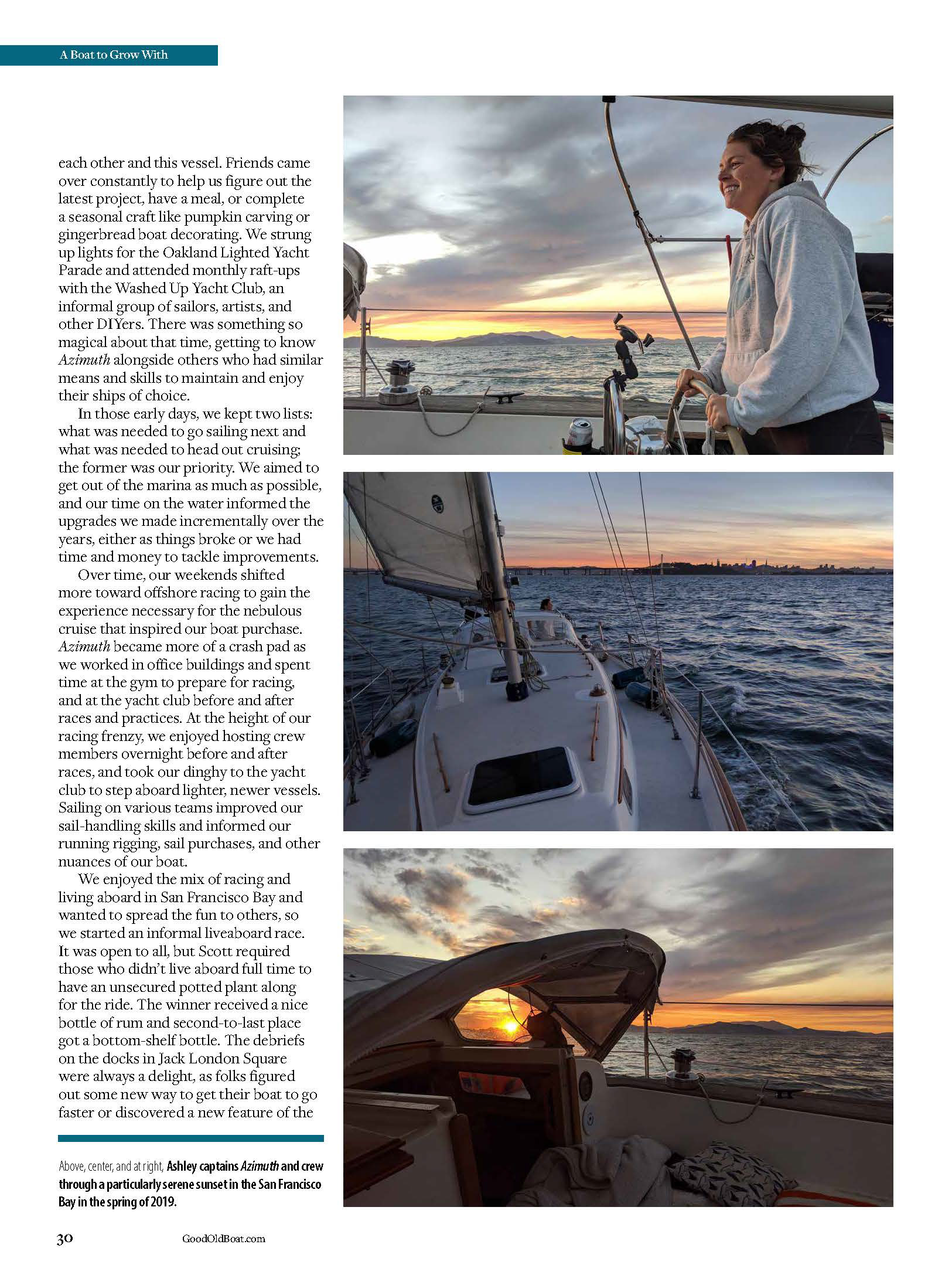
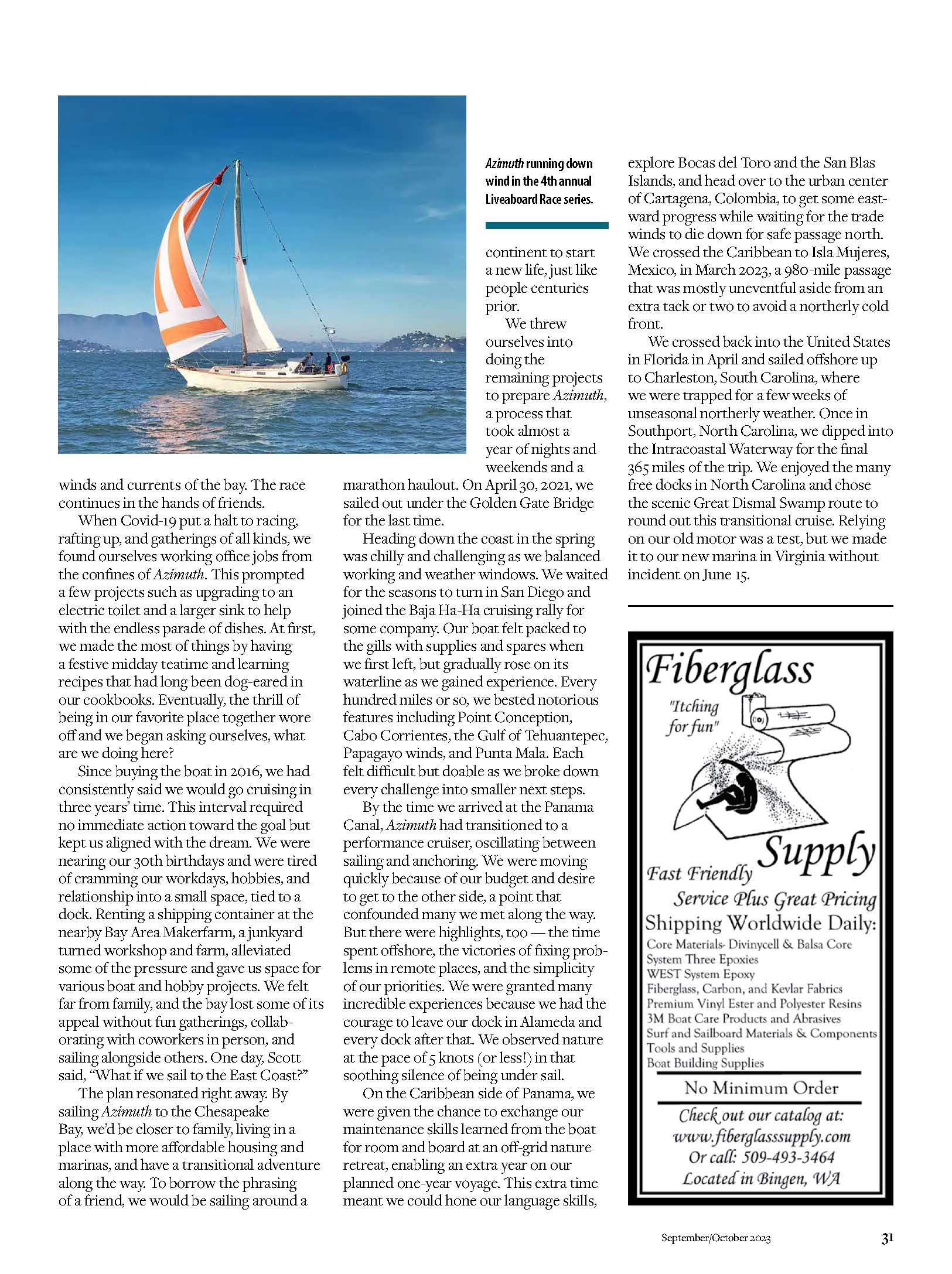
PROCESS HIGHLIGHTS
Collaborated with editors and stakeholders to uncover brand values and reader expectations. Determined the magazine needed to feel ruggedly approachable—not slick, but thoughtfully crafted.
Developed mood boards blending vintage maritime graphics and modern editorial aesthetics. Iterated through cover concepts, font treatments, and color palettes.
Created sample spreads using the new templates and brand elements. Shared them with the editorial and production teams to assess readability, tone, and print fidelity.
Compiled usage rules into a style document—covering logo usage, masthead sizing, type hierarchy, image placement, and ornamental details—to guide both in-house and freelance designers.
Applied the refreshed identity across multiple issues, monitoring print outcomes and reader feedback. Tweaked alignments, font sizes, and color contrast based on real-world printing tests and editorial needs.
OUTCOME
1. A refreshed Good Old Boat visual identity that honors its legacy while feeling sharper and more intentional.
2. Improved layout consistency and production speed, thanks to a reliable style system and templates.
3. Enhanced reader trust and engagement—pages feel more welcoming, legible, and reflective of the magazine’s craftsmanship.
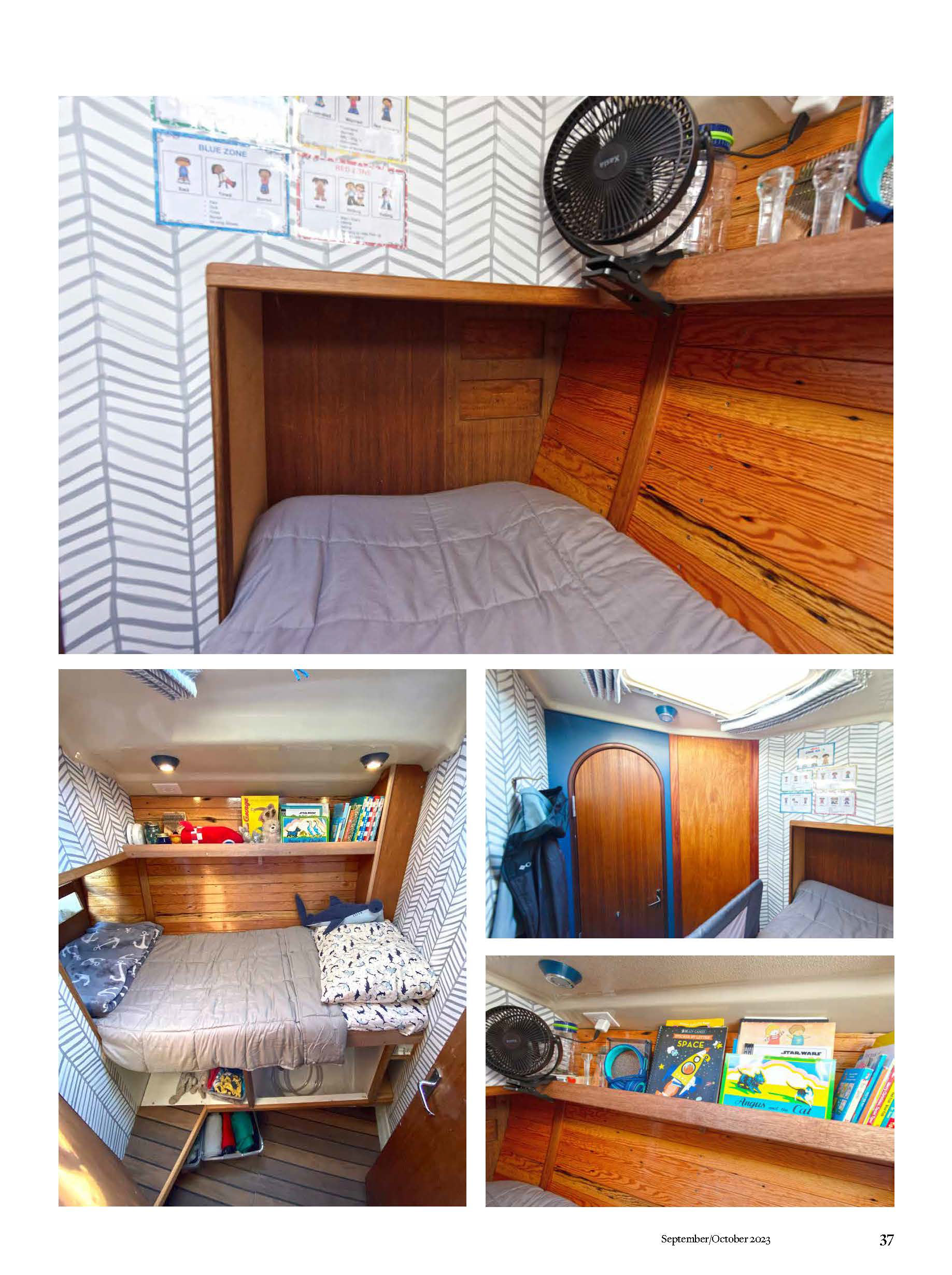
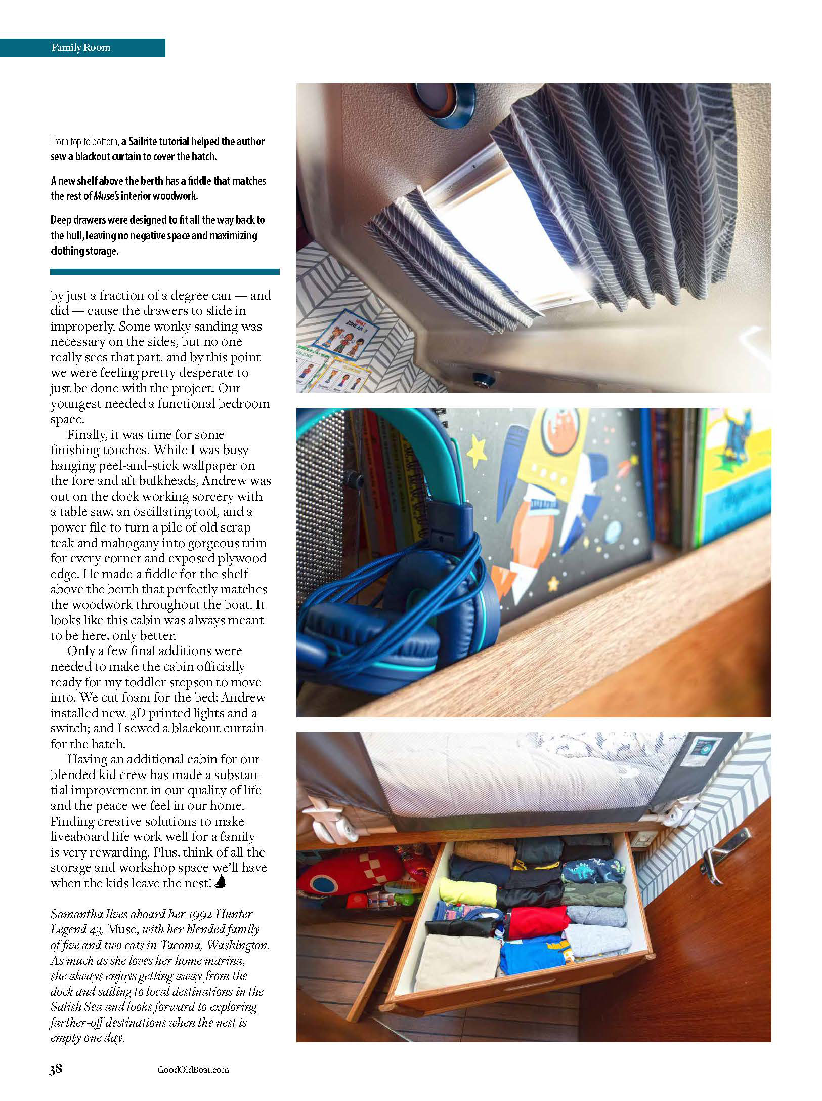
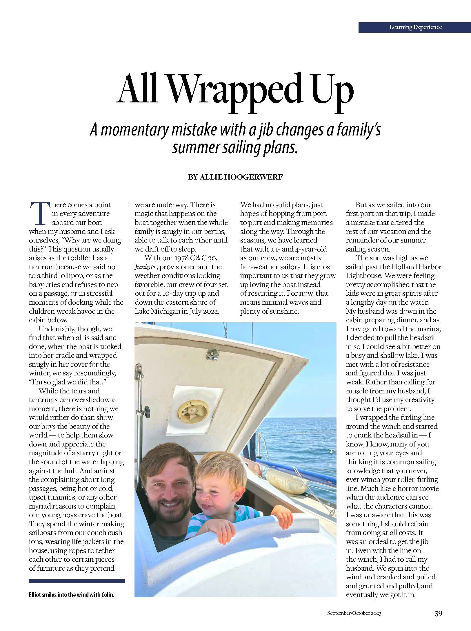
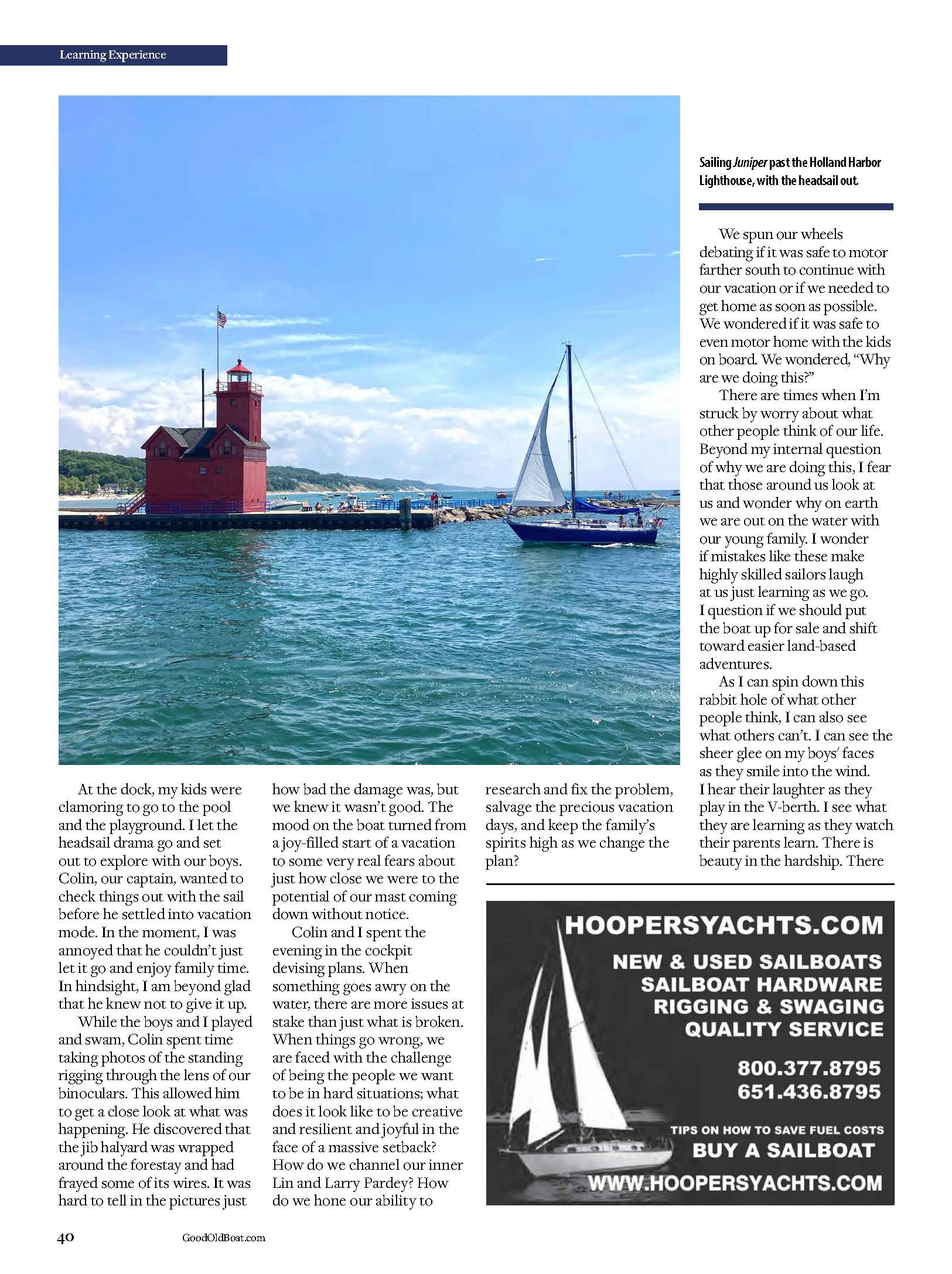
Re-brand and style guide update
Role: Creative Director, Designer
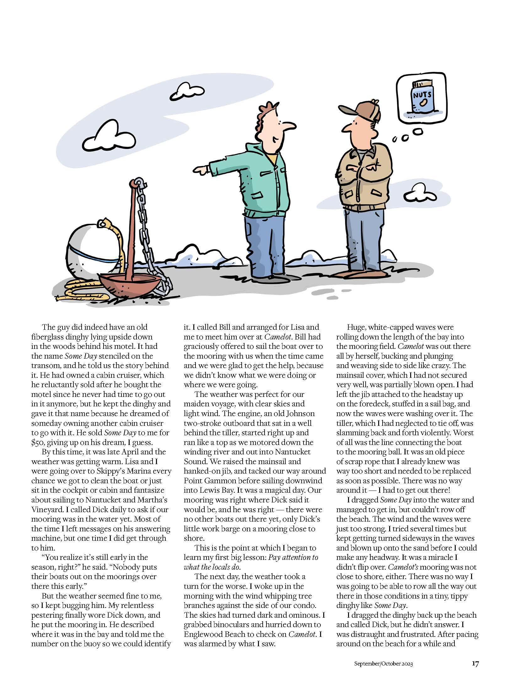
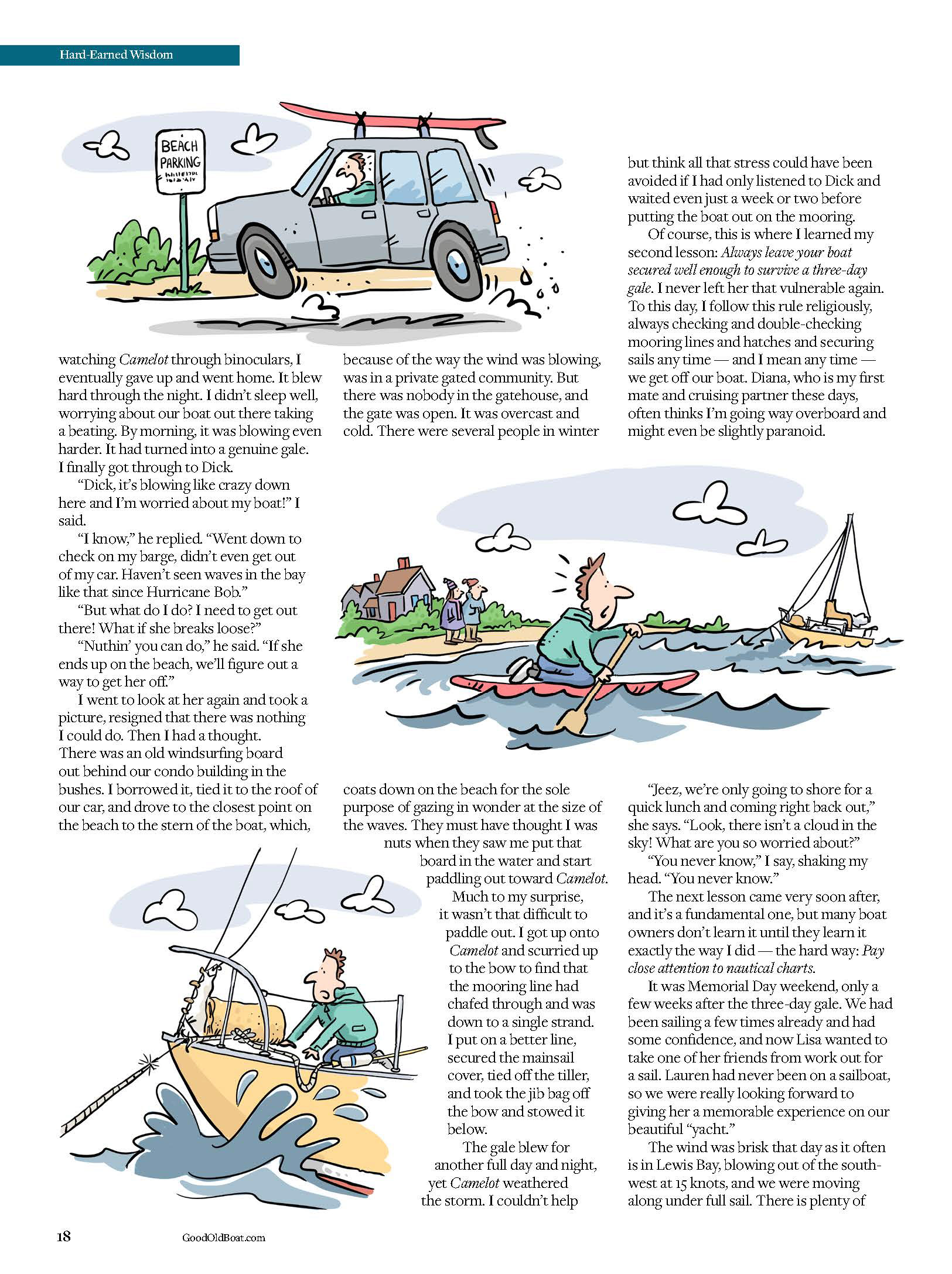
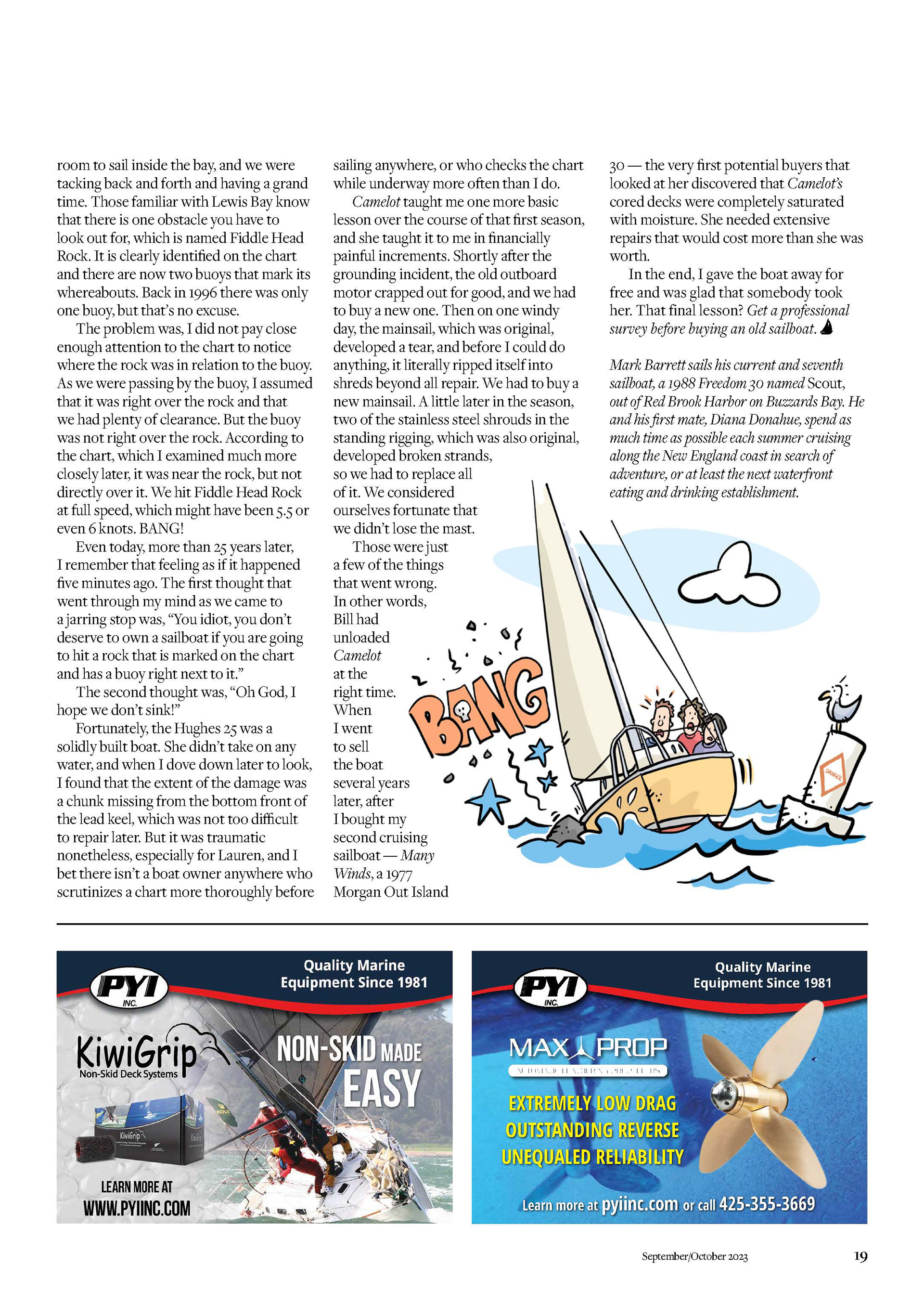
Additional Layout Examples
Role: Creative Director, Designer